This article was co-authored by Ryan Conway and by wikiHow staff writer, Amy Bobinger. Ryan Conway is a Marketing Expert and the Founder of Digital Tradesman, a digital marketing agency that helps builders, contractors, and tradesmen grow their business online. With over a decade of experience, he specializes in marketing, web design, and search engine optimization. Ryan holds a BS in Business Administration and Entrepreneurial Studies from Hartford University. He also studied Graphic and Web Design at the Boston University Center for Digital Imaging Arts. Ryan participated in Seth Godin’s altMBA in the winter of 2016.
There are 7 references cited in this article, which can be found at the bottom of the page.
wikiHow marks an article as reader-approved once it receives enough positive feedback. In this case, 100% of readers who voted found the article helpful, earning it our reader-approved status.
This article has been viewed 1,295,571 times.
Making a poster is a great way to advertise an upcoming event, tell people your point of view at a protest, or even just to decorate your room! Whether you draw your poster by hand or you design it digitally and print it out, it’s important to think about how your poster will read from both up close and far away. Once you have chosen your basic design, choose a font, colors, and embellishments that will help viewers instantly know what your poster is trying to say after you hang it up!
Steps
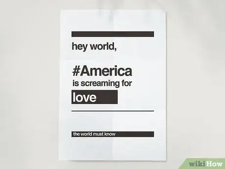
Sample Posters
Drawing Your Own Poster
-
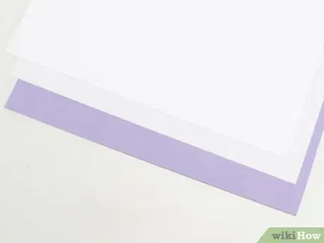
1Get a large piece of paper, poster board, or another backing material. A thicker poster will look more professional, but you can make a poster out of almost anything. You can use high-quality foam board from a craft store, poster board you found at the dollar store, or even printer paper that you’ve taped together if you don’t have anything else on hand.[1]
- If you’re making a poster to hang on the wall, poster board will work amazingly.
- If you’re making a protest sign, choose a sturdier material like foam core, which is durable enough to last through a rally, but still light enough to allow you to fight injustice all day.
- For more complex presentations, like a book report, opt for a tri-fold poster board.
-
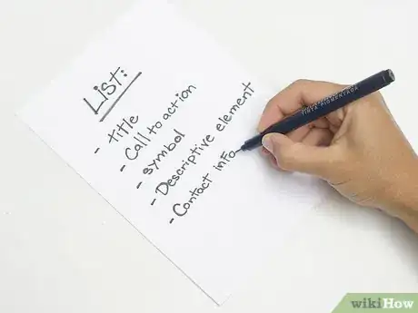
2Write a list of the elements you need to include in your poster. Think about what you really want to say, as well as any important information you need to include. At the same time, brainstorm different stylistic elements that will support your main point, and use this to drive the design.
- For example, if you’re making a poster to let people know about an upcoming food drive, your list might include the date, location, and time of the drive, as well as ideas for graphics like cans of vegetables, a plate of food, or a fork and a spoon.
Advertisement -
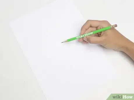
3Sketch out your design on a regular piece of paper. Sometimes it can take a little while to get the layout of your design just right, so it’s better to practice on regular paper, then scale your design. Focus on emphasizing the most important information right away, and use color and negative space to create contrast.[2]
- Don’t crowd the page too much, since a cluttered poster won’t have as much visual impact.
- Try to space out your letters evenly. In design, this is known as kerning. If you bunch them all together, your poster will be harder to read.
- If you prefer, you can use a computer-based painting or drawing program to design your poster, even if you plan to eventually draw it by hand.
-
4Have your main slogan or headline in the center of the poster. Most people will look at the center of your poster before anything else. Use this space to prioritize what you want the viewer to see right away, whether it’s a witty saying to emphasize a political view, or the fact that you’re planning an Earth Day party.
- Make sure your poster is easy to read up close and from a distance. Your headline text should be large and clear, in an easy-to-read font. If you include any graphics in your poster, they should be relatively simple and easy to make out no matter where you’re standing.
-
5Use the top, bottom, and sides for any important details. If your poster is informative, make sure you include all of the important information that a viewer would need to know, like phone numbers, addresses, prices of tickets for an event, or any other details.[3]
- Make sure your poster answers the questions what, where, and when, including both the date and time of your event.
-
6Include a call to action if you want people to act further. The call to action is an invitation to the viewer to follow up on the information in your poster, and it’s especially important if your poster is designed to promote an event. Your call to action can be whatever you want, but you should make sure it’s prominently featured in the poster’s design.[4]
- Some common calls to action include “Call (this number),” “Visit (your location or event),” or “Stop (pollution, for instance).”
- For instance, if you're making a poster for a concert, your call to action might be, "Visit our website to buy tickets!" Make sure to include the website either in the call to action or just below it.
-
7Sketch your design onto the poster board with pencil. Use the sketch you drew on paper to help guide you as you draw the design on the board. Remember to pay attention to the spacing of your letters so they don’t all end up crowded on one side of the poster board, and try to make all of your letters roughly the same size.[5]
- By using pencil, you’ll be able to erase any mistakes you make.
- Lightly draw a guide line with your pencil and a ruler if you need help keeping your letters straight.
- If you make too many mistakes, just flip the board over and start again on the other side.
-
8Color your poster with colored pencils, crayons, markers, or paint. Adding color will make your poster more eye-catching, and it can help emphasize the point you’re trying to make. Think about how colors and emotions are connected when you’re choosing the colors for your poster.[6]
- Red, orange, and yellow are energizing colors, making them great for political signs and event posters.
- Blues and greens are peaceful, so they’re good for PSAs and informative posters.
- Plain black and white can make a powerful statement as well.
-
9Add embellishments like symbols, graphics, and glitter. When it comes to decorating your poster, you’re only limited by your own imagination. Tap into your creativity and see what you come up with! You can get ribbon, glitter, stickers, or other decorations at the craft store, or you could just look through what you have on hand. Don’t go overboard, though, because with embellishments, less is more.[7]
- If you’re creating a poster for a charity event or a school dance, try outlining your letters in glitter glue for a fun pop of sparkle.
- Symbols can make a powerful impact on a poster without needing to add any additional words. For example, a peace sign is the perfect addition to an anti-war poster.
- You can also print out a picture and include it on your poster, but make sure to use either a picture you took yourself or a free stock photo. Don’t use someone else’s copyrighted work.
Designing and Printing a Poster Online
-
1Search online for an image-editing software or a poster creation website. There are a number of different options if you want to design and print your poster digitally rather than drawing it by hand. You can either design the poster in an image-editing software like Photoshop or Paint, then print it out yourself, or you can choose a website where you can design your own poster and have it printed and shipped to you.[8]
- If you decide to go with a website where you can design and order a poster, be sure to read through customer reviews to find one that’s reliable and reputable.
- If you're planning to print the poster yourself, you may need to go to a specialty printing store.
- Some popular poster-design websites include Canva, Adobe Spark Post, Venngage, and Piktochart.
-
2Decide on the size of your poster. Whether you’re printing your own poster or ordering it, you’ll be able to choose from a variety of sizes and dimensions for your poster. If you know in advance how big the poster will be, you can scale your text and graphics to fit the page.[9]
- Opt for smaller posters that are about 11 by 17 inches (28 cm × 43 cm) if you want to print them in bulk and hand them out, like flyers.
- Medium-sized posters, or about 18 by 24 inches (46 cm × 61 cm), are great for putting up in the halls at school.
- Large posters are often used for movies or advertisements, and they are usually about 27 by 40 inches (69 cm × 102 cm).
-
3Pick a template for your poster if you want one. Both poster-design websites and image-creation software should have pre-set templates that you can use to help you arrange your text and images on the page. These are fully customizable, so feel free to play with the location, font, and sizing of any elements in the template.[10]
-
4Include any necessary information on your poster. When someone stops to read your poster, they should be able to easily find any information they need. If you're advertising an event, for instance, make sure your poster tells readers the date, time, and location of the event. You should also include any relevant websites or phone numbers that people might need to know.
- If you want the public to purchase tickets, be sure to include the ticket price as well.
-
5Choose a font that matches your message. The font that you use should match the purpose of your poster. A serious message would look silly with a childlike font, while a thick, bold text would be an odd choice for a poster promoting a romantic dinner at a local restaurant.[11]
- A bold, easy-to-read font like Futura, Impact, or Clarendon is a good choice for a political poster.
- A soft, scrolled font like Bickham Script Pro or Corsiva is ideal for an upscale fundraiser or other formal events.
- If you’re designing a poster for a children’s party, consider a playful font like Comic Sans MS, School bell, or TomKid.
-
6Add in color to make your poster more eye-catching. As you’re choosing the design for your poster, think about what each color says. Cool colors are calming, while bright colors are energetic and bold.[12]
- If you’re having a pool party, blue, green, and yellow are perfect.
- Black and white with a splash of red will make a strong impact on a protest sign.
-
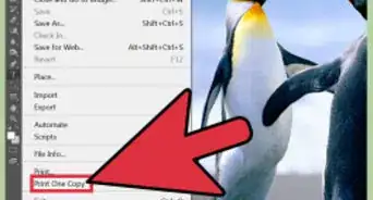
7Print or order your poster. If you want to print the poster in person, save your design to a thumb drive and take the file to a local print shop. Otherwise, order the poster from the site where you designed it and have it shipped directly to you.[13]
- If you don’t have a lot of money or you can’t get to a print shop, print out your design on multiple sheets of paper and tape or glue them to a larger piece of posterboard.
Community Q&A
-
QuestionWhat special touches can I add to make my poster stand out?
 Community AnswerAdd little things such as collages or drawn pictures. If you're going for a more professional look, use varying fonts or styles of writing. Consider sticking leaflets and spider diagrams on to create additional information that is quick to read, as opposed to a block of text.
 -
QuestionHow do I make a sports poster?
 Community AnswerMake your poster visually energetic with color coordinated blocks of text. Pick two colors for a specific sport, like orange and black for basketball or green and gray for tennis. Write important, more specific information in the brighter color, so that your poster is not too loud. Add small pictures of courts/fields and larger ones of famous teams. Consider making a small collage in one corner or a border made one photo width wide. If you decide to do the border, ensure that the pictures are straight and are the same size, otherwise it can look messy and unprofessional. Finally, you may want to include littlest touches, such as writing tips on printed pictures.
 -
QuestionWhat should I include in a poster about life?
 Community AnswerAn inspirational quote somewhere would be a nice touch.
Expert Interview
Thanks for reading our article! If you'd like to learn more about advertising, check out our in-depth interview with Ryan Conway.
References
- ↑ https://www.popsci.com/how-to-make-best-protest-sign
- ↑ http://extension.colostate.edu/docs/staffres/poster.pdf
- ↑ https://designshack.net/articles/inspiration/10-tips-for-perfect-poster-design/
- ↑ https://designshack.net/articles/inspiration/10-tips-for-perfect-poster-design/
- ↑ http://extension.colostate.edu/docs/staffres/poster.pdf
- ↑ https://www.fastcompany.com/3067314/how-to-make-the-perfect-protest-sign
- ↑ https://www.fastcompany.com/3067314/how-to-make-the-perfect-protest-sign
- ↑ https://www.canva.com/learn/25-ways-to-design-an-awesome-poster-and-create-a-buzz-for-your-next-event/
- ↑ http://standardpostersizes.com/standard-poster-size/
- ↑ https://www.canva.com/learn/25-ways-to-design-an-awesome-poster-and-create-a-buzz-for-your-next-event/
- ↑ https://www.canva.com/learn/25-ways-to-design-an-awesome-poster-and-create-a-buzz-for-your-next-event/
- ↑ http://www.cogsci.uci.edu/~ddhoff/FromColorToEmotion.pdf
- ↑ https://www.canva.com/learn/25-ways-to-design-an-awesome-poster-and-create-a-buzz-for-your-next-event/
About This Article
To make a poster, design your layout with the headline, slogan, or event written at the top of the poster, then use the sides and bottom of the poster to include important information like a phone number or event date. You can then sketch your design onto poster board by hand or create it digitally using a program like Photoshop. Color in the words and add an image, logo, or other design to make the poster look interesting! If you want to learn how to order multiple prints of your poster, keep reading the article!


