This article was co-authored by Vikas Agrawal. Vikas Agrawal is a Visual Content Marketing Expert & Entrepreneur, as well as the Founder of Full Service Creative Agency Infobrandz. With over 10 years of experience, he specializes in designing visually engaging content, such as infographics, videos, and e-books. He’s an expert in Making content marketing strategies and has contributed to and been featured in many publications including Forbes, Entrepreneur.com, and INC.com.
This article has been viewed 109,513 times.
The design of a poster is important, especially if you’re using it as a visual aid to add to a verbal presentation. We'll show you how to choose the correct colors, images, fonts, and balance so you can design a memorable poster.
Steps
Choosing Your Color Scheme
-
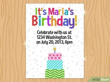
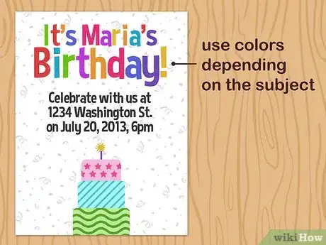
1Make it visually appealing. The point of adding color to your poster is to make it visually appealing; it should draw and audience. Too much color is confusing.[1] One or two accent colors that are eye-catching and emphasize your subject is all you need.
-
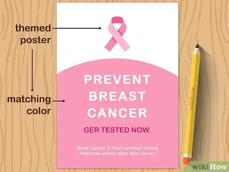
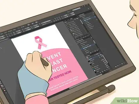
2Understand the message and audience. If your poster is themed use a matching color. For instance, if you’re doing a presentation about breast cancer, be sure to use the correct pink. The audience will see this and be drawn to it because it’s familiar.Advertisement
-
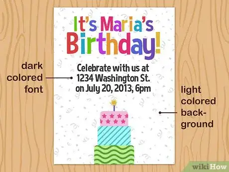
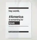
3Use dark colored font. Use a poster that has a light colored background and a dark colored text. This not only saves a tremendous amount of ink, but makes it easier for your audience to read.
Using Helpful Images
-
1Ask yourself if images are helpful. You have limited space on your poster, so use the space wisely. If you’re going to use images, they should be figures, diagrams, graphics, or tables that are easy-to-read and help illustrate your ideas.[2]
- Charts are a great visual aid for a poster. They are a good way to add blocks of color while adding a visual explanation of your ideas.
- Clip art rarely illustrates the ideas that you’re trying to get across in posters. Choose other images to help with this.
-
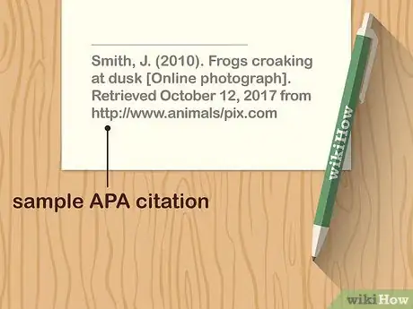
2Cite your pictures. Make sure the pictures that you’re using are public domain. Just because you can copy them from google, doesn’t mean they’re appropriate to use. If you are going to use a picture from here, be sure to post a citation for it on your poster.
-
3Make them a good size. You want your graphics to be easily read from a distance of at least 5 feet.[3] This means they should be no smaller than 5” x 7”. You also don’t want them to take over the entire poster—your font is the important part of the poster. Create a good balance between the two.
-
4Use appropriate placement. Don’t overlap your images over your font, but make sure they are next to any wording that helps explain them. You shouldn’t be using these just to fill a giant empty space. All of your images should have purpose.
Picking the Fonts
-
1Know your styles. You should use a simple, clean and professional writing for the majority of your text. On a computer, these are your serif fonts, such as Times New Roman, or Palatino. These fonts are easier to read, especially at a smaller size. You also have the choice of san serif fonts, such as Arial, Comic Sans, or Helvetica. These fonts can be used sparingly to add visual appeal to your poster.
- Mix them up. It will help differentiate your titles from your informational text—making your titles stand out more.
- If you’re using your handwriting instead of computer font, mix up your writing style to add interest to your poster.
-
2KISS it. The acronym “K.I.S.S.” stands for keep it short and simple. You don’t want your poster to be overpowered by words. If you use too many words, many people won’t bother reading it all. You want your main ideas to be portrayed on the poster, but you should be going into depth with your verbal presentation rather than with your visual aid.
-
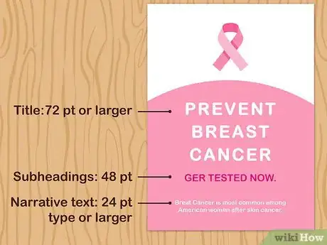
3Make your writing the right size. Just as your images, all of your lettering should be legible from at least 5 feet away.[4]
- Title: 72-point or larger
- Names/Subheadings: 48-point type
- Narrative text: 24-point type or larger
Balancing Your Poster
-
1Emphasize the most important information. Highlight the most important aspect of your poster with a cluster of images and color. This will draw the audience’s eye to that part of the poster.
-
2Connect with your viewers. If your viewers are a younger crowd, you would use more loud colors and different fonts than if your viewers are an older, professional group. This goes for you images as well. Use charts and graphs to explain things for a work presentation, or use creative characters to help show off safety features for a children’s toy.
-
3Remember the 1/3-2/3 rule. 1/3 of your poster should be white space. 2/3 of it should be text and images. This creates a balance that is aesthetically pleasing to your audience.[5]
Community Q&A
-
QuestionHow can I make a space-themed poster?
 Sumalatha KareddlaCommunity AnswerDraw some planets on the background, Make the colour of the background look like space. Make sure to leave some space. You can draw the border as aliens in a line.
References
About This Article
If you want to design a poster, make it eye-catching by using a dark-colored font on a light-colored background. Then, pick 1 or 2 accent colors to make the poster really pop. If you use any images, make sure they help reinforce the message you’re sending with your poster. For instance, you might include a picture of a cake if your poster is for someone’s birthday, or you might use a flag if your poster is for a local election. For tips on how to choose the best font for your poster, read on!
