wikiHow is a “wiki,” similar to Wikipedia, which means that many of our articles are co-written by multiple authors. To create this article, 13 people, some anonymous, worked to edit and improve it over time.
This article has been viewed 51,042 times.
Learn more...
A slideshow is a series of images, sometimes featuring text, that is meant to be projected onto a flat surface for group viewing. The most common type of slideshow today is the computer slideshow, a common component in lectures and speeches. Read the steps below to learn how to make your own computer slideshow.
Steps
Sample Slideshows
Using the Software
-
1Open the program. This guide assumes that you will be using Microsoft PowerPoint, since it's the most commonly used software for making slideshows. You will see a blank slide with title and text prompts in separate text fields on it, plus various menus and buttons.
-
2Create your title page. Click in the upper text field and name your presentation, then add your name and today's date in the lower text field. This is also a good chance to get used to changing stylistic elements on your slideshow, like background color and font.
- Choose a short title. Unless you're making a high-level academic presentation intended for a conference, it is better to think of a short, straightforward title that explains your general topic to the audience quickly.
- Use a simple font. Visually complex fonts, such as “old English” fonts and puffy letters, are fun to look at on a computer screen, but hard for an audience to read. Feel free to experiment, but settle on a simple font with clean lines so that your audience won't have to squint to read it.
- You can change fonts by choosing them from the drop-down menu along the top of the screen. If you have text highlighted when you change fonts, that text will change to the selected font.
- Experiment with color. Your title page can have a different background color than the rest of your presentation, but most people choose one theme for the entire slideshow.
- Right-click the background of the slide and choose the “slide background” or “format background” option from the menu that pops up. From there, you can play with the color as you like.
- Be sure that your background color and text color pop from each other so that the slide is easy to read. Generally speaking, text should be black or white for maximum readability, and backgrounds should not be neon or extremely bright.
- There is nothing wrong with a plain-looking slideshow for business or academic purposes; in fact, simpler is generally considered better in these environments.
Advertisement -
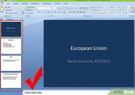
3Add slides. You can type control-m to add a slide to your slideshow, or you can choose the “new slide” option from the top of the screen. Try to keep your pacing to one idea or point per slide so that it's easy to follow.
- Add layouts. Each slide has a large number of preset layout options, so choose the one that's best for each slide.
- Most slides without pictures can use one of the two basic text slide layouts. One has a title bar, the other is simply a text field. Choose whichever one you prefer.
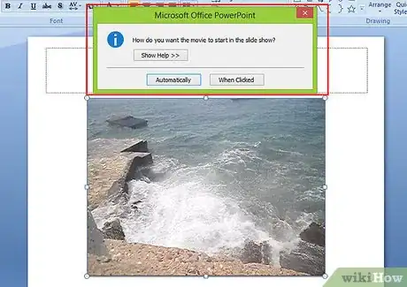
- Choosing a slide layout designed to accommodate pictures, movies, or sound files is the easiest way to insert them. Simply choose the field you want to add a file to, click the icon that represents the type of file you want, and add it by selecting it from the window that pops up.
- Try adding text in one field and a picture in another field for a professional look.
- Don't go overboard on images, movies, or sounds. Less is more, in most cases.
- Clean up. You can delete extra slides by right-clicking on them and choosing “delete slide.”
- Organize. You can reorder slides by dragging them along the timeline and inserting them in the appropriate spots. The timeline is the overview list of your slides along the top or side of the screen.
- Add layouts. Each slide has a large number of preset layout options, so choose the one that's best for each slide.
-
4Add finishing touches. There are a few more things you can do to complete your slideshow project. Once you're satisfied, save it so that you can be sure you'll still have it when it's time to use it.
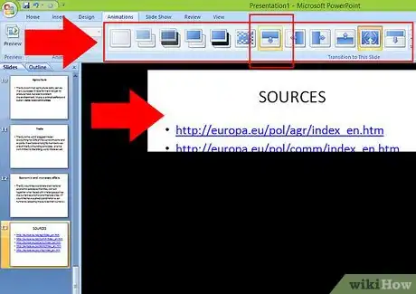
- Be wary of transitions. PowerPoint and most similar programs come preloaded with a wide array of slide transitions. These are visual effects, sometimes accompanied by sounds, that occur when switching between slides. They're generally seen as tacky and distracting, but may be appropriate in some cases.
- Never use sound effects with your transitions. They get in the way of your speech.
- Use simple transitions rather than fancy ones. A page wipe from top to bottom is fancy enough; there's no need to use silly shapes or gradient effects.
- Use transitions sparingly. Even if you've decided transitions are a useful element for your slideshow, avoid applying a transition to every slide. Instead, use them to denote different sections of your show, once per section.
- Add sources and legal information. After your slideshow, add one more slide (or as many as are needed) where you briefly list all your information sources (for business or academic slideshows), image sources (if copyrighted), and any thanks or acknowledgments you wish to include.
- Be wary of transitions. PowerPoint and most similar programs come preloaded with a wide array of slide transitions. These are visual effects, sometimes accompanied by sounds, that occur when switching between slides. They're generally seen as tacky and distracting, but may be appropriate in some cases.
-
5Do a practice run. Typically, you can run the slideshow by pushing the F5 key on your computer. You can advance slides by clicking the left mouse button. Exit the show by pushing the Esc key at any time, or reaching the end of the slideshow and clicking again.
- Go back and make any last-minute adjustments that need to be made. Watching your slideshow before you plan to use it can often reveal typos and other small errors you missed during creation.
- Speak along with your slideshow. Make sure that the slideshow is streamlined enough so that it doesn't steal your thunder, but detailed enough that you don't run out of slides halfway through your speech. Practice timing your slide changes until you feel comfortable.
Slideshows for School
-
1Create an outline. If you're making a slideshow for a school presentation, chances are you'll be providing a speech or lecture to go along with it. Kill two birds with one stone by starting with a clear outline for your presentation.
- There are many ways to make an outline. The standard method uses indentation and a numbering/lettering system to organize information by level of importance, but feel free to use your own approach if you prefer.
- Your speech will be more detailed than your outline, but your slideshow will be less detailed. Once you've got an outline ready, mark every major point, as well as every point at which you would like to have a picture or other multimedia element to serve as accompaniment. Plan to make a slide for each mark.
- Use index cards or an outline for your speech. Don't use your slideshow as your guide, or you'll have to keep glancing at it, which looks unprofessional.
-
2Use a simple theme. Avoid bright colors, and stick to sans-serif fonts, like Arial, for titles and subtitles.
- Black on white and white on black are the two least irritating color combinations for a slideshow presentation. They are easy to read and not distracting.
- Neutral blue and gray shades with black or white text are also acceptable.
- Avoid warm colors and clashing colors, as well as colors that are too similar to one another.
- Serif fonts (such as Times New Roman) are acceptable for regular (non-titling) text, especially if many of your points will be longer than one line on the page. Whichever you choose, be sure to be consistent throughout the slideshow.
- Black on white and white on black are the two least irritating color combinations for a slideshow presentation. They are easy to read and not distracting.
-
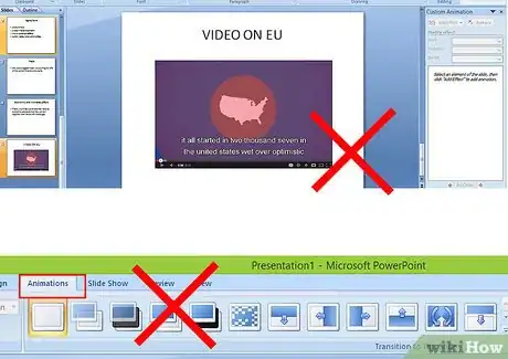
3Add media as needed. Only add movies and music if they are directly appropriate to your topic, and keep them as short as possible. Pictures should be added when appropriate.
- 30 seconds is a good target length for movie and music files. You shouldn't let your media make your speech for you. Using longer videos and songs will get you a lower grade, because it'll seem like you're just trying to fill in a short speech so it hits the required minimum time.
- There are two good ways to add pictures:
- Add one picture per slide to slides that require text alongside the picture. Keep it reasonably sized and relevant to the slide.
- Add up to four pictures per slide if the slide has no text, but only for the purpose of illustrating examples of something. This slide will be short; only flash it for a few seconds in your presentation and be sure to talk over it.
- An image on the title page may also be appropriate, depending on the topic of your slideshow, but it isn't necessary to a good slideshow.
Slideshows for Business
-
1Use a tight format. Everyone who is viewing your slideshow is getting paid for their time. Most of them would probably rather be earning their money doing something other than watching your presentation, so make it short, punchy, and straight to the point.
- Keep it brief. Unless instructed to hit a certain target length by your boss, make your presentation as short as possible. Don't spend a lot of time on illustrative examples beyond what you think is necessary to get your point across.
- Prepare handouts for your audience so that you don't have to cover every small detail in your presentation. Put in-depth information in the handout, and use the slideshow and presentation time for painting the big picture.
- Keep it brief. Unless instructed to hit a certain target length by your boss, make your presentation as short as possible. Don't spend a lot of time on illustrative examples beyond what you think is necessary to get your point across.
-
2Keep non-text elements to a minimum. Charts and graphs are fine, where necessary, but other graphics should be simple and unobtrusive.
- Consider using clip art. Clip art is a stock of simple, black-and-white images that are not copyrighted. Nearly every slideshow program comes with a limited clip art library. The simplicity of clip art makes it an ideal choice for accenting slides with graphical elements while avoiding a lot of clutter and visual noise.
- Don't ever use movies or music in a business presentation unless you have an ironclad reason for doing so.
- Don't use slide transitions. Nobody in your audience cares about them, which means they're just a waste of time.
-
3Match your speech to your slideshow. More so than in other environments, a business slideshow and its accompanying speech should be nearly identical in terms of substantive content. Aside from a brief introduction and connecting phrases, your speech should more or less follow the slideshow point for point.
- Use handouts to your advantage. If you prepared a handout, as recommended above, tell people to refer to certain sections of it as you give your speech. They'll be able to easily get more information without you having to cram it into the slideshow.
-
4End with a point. As opposed to an academic slideshow, the end of your business presentation isn't a simple conclusion; it's a clear and bold call to action, an imperative statement that is supported by your presentation rather than an educated opinion that is explained by it. This difference in tone is all-important in getting people to take your presentation seriously.
Slideshows for Fun
-
1Choose a theme. Pick anything you want. Many people make slideshows out of family vacations, reunions, or other shared experiences. You could also choose to explore a favorite hobby or sport.
- Add structure. You certainly don't have to have a clear structure for a slideshow you're making for your own enjoyment, but if you'd like to make a statement about something or present information you've learned, it helps.
- Think about the way you would naturally explain your slides to a friend, and then organize them to reflect that.
- Add structure. You certainly don't have to have a clear structure for a slideshow you're making for your own enjoyment, but if you'd like to make a statement about something or present information you've learned, it helps.
-
2Get your pictures. One of the best parts of making a slideshow for fun is that you can pretty much do whatever you want with it. For most people, that means a lot of pictures. Download them from the Internet or use your own photographs, as you like.
- If you're using images that might be copyrighted, be cautious. Most people aren't going to hunt you down and sue you for making a “Day at the Beach” family slideshow with a copyrighted image of a beach ball and uploading it to YouTube, but use common sense.
- Give credit at the end of the slideshow whenever you can find the appropriate information.
- Don't use any images that are marked with the words “do not reuse without permission” or anything similar.
- If you're using images that might be copyrighted, be cautious. Most people aren't going to hunt you down and sue you for making a “Day at the Beach” family slideshow with a copyrighted image of a beach ball and uploading it to YouTube, but use common sense.
-
3Add multimedia. Insert whatever sound and video clips you want. Go wild; this is your personal project.
- Again, be careful when using clearly copyrighted material. Try to keep clips short, and give credit where it's due.
-
4Add whatever transitions you want. Yes, they're tacky. They're also kind of fun, especially with the sound effects turned on. If you feel like loading up your slideshow with cheesy transition effects, go right ahead.
-
5Review your slideshow. Even though you made it for your own benefit, you should check it before you show it to anyone else.
- Be sure the color schemes you are using don't hurt your eyes.
- Check to make sure the slides are all in the order you want them to be in.
- Add captions to images if it makes sense, so you don't have to explain every picture.
Community Q&A
-
QuestionHow can I create my own slideshow with my phone?
 Community AnswerThe easiest way to create is from online slideshow-making apps, such as Animoto, Picovico, Magisto, and Stupeflix. These are free to use and provide themes and audios. These apps can easily share and download copies.
Warnings
- Don't use copyrighted photos without permission. Use clip art and original images instead.⧼thumbs_response⧽
Things You'll Need
- A computer
- Slideshow software, such as Microsoft PowerPoint or OpenOffice.org Impress
- A topic or theme
About This Article
1. Open PowerPoint.
2. Create a title page.
3. Add slides.
4. Keep transitions and effects to a minimum.
5. Add sources and legal info.
6. Do a practice run.


