X
This article was co-authored by wikiHow staff writer, Jack Lloyd. Jack Lloyd is a Technology Writer and Editor for wikiHow. He has over two years of experience writing and editing technology-related articles. He is technology enthusiast and an English teacher.
The wikiHow Tech Team also followed the article's instructions and verified that they work.
This article has been viewed 1,249,617 times.
Learn more...
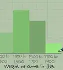
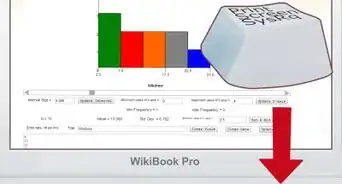
This wikiHow teaches you how to create a histogram bar chart in Microsoft Excel. A histogram is a column chart that displays frequency data, allowing you to measure things like the number of people who scored within a certain percentage on a test.
Steps
Part 1
Part 1 of 3:
Inputting Your Data
-
1Open Microsoft Excel. Its app icon resembles a white "X" on a green background. You should see the Excel workbook page open.
- On a Mac, this step may open a new, blank Excel sheet. If so, skip the next step.
-
2Create a new document. Click Blank workbook in the upper-left corner of the window (Windows), or click File and then click New Workbook (Mac).Advertisement
-
3Determine both your smallest and your largest data points. This is important in helping figure out what your bin numbers should be and how many you should have.
- For example, if your data range stretches from 17 to 225, your smallest data point would be 17 and the largest would be 225.
-
4Determine how many bin numbers you should have. Bin numbers are what sort your data into groups in the histogram. The easiest way to come up with bin numbers is by dividing your largest data point (e.g., 225) by the number of points of data in your chart (e.g., 10) and then rounding up or down to the nearest whole number, though you rarely want to have more than 20 or less than 10 numbers. You can use a formula to help if you're stuck:[1]
- Sturge's Rule - The formula for this rule is K = 1 + 3.322 * log(N) where K is the number of bin numbers and N is the number of data points; once you solve for K, you'll round up or down to the nearest whole number. Sturge's Rule is best used for linear or "clean" sets of data.
- Rice's Rule - The formula for this rule is cube root (number of data points) * 2 (for a data set with 200 points, you would find the cube root of 200 and then multiply that number by 2). This formula is best used for erratic or inconsistent data.
-
5Determine your bin numbers. Now that you know how many bin numbers you have, it's up to you to figure out the most even distribution. Bin numbers should increase in a linear fashion while including both the lowest and the highest data points.
- For example, if you were creating bin numbers for a histogram documenting test scores, you would most likely want to use increments of 10 to represent the different grading brackets. (e.g., 59, 69, 79, 89, 99).
- Increasing in sets of 10s, 20s, or even 100s is fairly standard for bin numbers.
- If you have extreme outliers, you can either leave them out of your bin number range or tailor your bin number range to be low/high enough to include them.
-
6Add your data in column A. Type each data point into its own cell in column A.
- For example, if you have 40 pieces of data, you would add each piece to cells A1 through A40, respectively.
-
7Add your bin numbers in column C if you're on a Mac. Starting in cell C1 and working down, type in each of your bin numbers. Once you've completed this step, you can proceed with actually creating the histogram.
- You'll skip this step on a Windows computer.


Advertisement
Part 2
Part 2 of 3:
Creating the Histogram on Windows
-
1Select your data. Click the top cell in column A, then hold down ⇧ Shift while clicking the last column A cell that contains data.
-
2Click the Insert tab. It's in the green ribbon that's at the top of the Excel window. Doing so switches the toolbar near the top of the window to reflect the Insert menu.
-
3Click Recommended Charts. You'll find this option in the "Charts" section of the Insert toolbar. A pop-up window will appear.
-
4Click the All Charts tab. It's at the top of the pop-up window.
-
5Click Histogram. This tab is on the left side of the window.
-
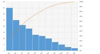
6Select the Histogram model. Click the left-most bar chart icon to select the Histogram model (rather than the Pareto model), then click OK. Doing so will create a simple histogram with your selected data.
-
7Open the horizontal axis menu. Right-click the horizontal axis (e.g., the axis with numbers in brackets), click Format Axis... in the resulting drop-down menu, and click the bar chart icon in the "Format Axis" menu that appears on the right side of the window.
-
8Check the "Bin width" box. It's in the middle of the menu.[2]
-
9Enter your bin number interval. Type into the "Bin width" text box the value of an individual bin number, then press ↵ Enter. Excel will automatically format the histogram to display the appropriate number of columns based on your bin number.
- For example, if you decided to use bins that increase by 10, you would type in 10 here.
-
10Label your graph. This is only necessary if you want to add titles to your graph's axes or the graph as a whole:
- Axis Titles - Click the green + to the right of the graph, check the "Axis Titles" box, click an Axis Title text box on the left or the bottom of the graph, and type in your preferred title.
- Chart Title - Click the Chart Title text box at the top of the histogram, then type in the title that you want to use.
-
11Save your histogram. Press Ctrl+S, select a save location, enter a name, and click Save.


Advertisement
Part 3
Part 3 of 3:
Creating the Histogram on Mac
-
1Select your data and the bins. Click the top value in cell A to select it, then hold down ⇧ Shift while clicking the C cell that's across from the bottom-most A cell that has a value in it. This will highlight all of your data and the corresponding bin numbers.
-
2Click Insert. It's a tab in the green Excel ribbon at the top of the window.
-
3Click the bar chart icon. You'll find this in the "Charts" section of the Insert toolbar. Doing so will prompt a drop-down menu.
-
4Click the "Histogram" icon. It's the set of blue columns below the "Histogram" heading. This will create a histogram with your data and bin numbers.
- Be sure not to click the "Pareto" icon, which resembles blue columns with an orange line.
-
5Review your histogram. Before saving, make sure that your histogram looks accurate; if not, consider adjusting the bin numbers and redoing the histogram.
-
6Save your work. Press ⌘ Command+S, enter a name, select a save location if necessary, and click Save.


Advertisement
Community Q&A
-
QuestionThe histograms I'm trying to represent have different class widths represented as different width blocks, and they are not replicating. How do I get different class widths?
 Community AnswerYou need to go to Setting > Option >Class and then choose your class.
Advertisement
Warnings
- Make sure your histogram makes sense before drawing any conclusion from it.⧼thumbs_response⧽
Advertisement

References
About This Article
Jack Lloyd
wikiHow Technology Writer
This article was co-authored by wikiHow staff writer, Jack Lloyd. Jack Lloyd is a Technology Writer and Editor for wikiHow. He has over two years of experience writing and editing technology-related articles. He is technology enthusiast and an English teacher. This article has been viewed 1,249,617 times.
How helpful is this?
Co-authors: 23
Updated: March 29, 2019
Views: 1,249,617
Categories: Microsoft Excel
Advertisement