wikiHow is a “wiki,” similar to Wikipedia, which means that many of our articles are co-written by multiple authors. To create this article, 17 people, some anonymous, worked to edit and improve it over time.
This article has been viewed 216,171 times.
Learn more...
A histogram is a graph that shows the frequency, or the number of times, something happens within a specific interval. A histogram is similar to a bar chart; however, the area represented by the histogram is used to graph the number of times a group of numbers appears. You may want to use a histogram to display continuous data such as time, measurements, and temperature. However, a problem with histograms is that it is difficult to compare two sets of data and exact data cannot be read. Knowing how to draw a histogram can by very useful for students to represent statistical findings of a project as well as for business professionals.
Steps
Drawing by Hand
-
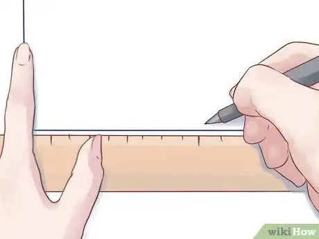
1Using a ruler, draw out the basic axes. These are the vertical and horizontal lines that form basic outline of the histogram. If you have trouble making the right angle where the axes meet, go ahead and cheat: use a corner of a sheet of paper!
-
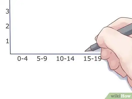
2Measure out the groups. In a histogram, the data is visualized in groups. These groups are evenly distributed, so you'll need to make set marks along your lower axis.[1]
- For example: 0-4 apples, 5-9 apples, 10-14 apples, etc at 1", 2", and 3" along the axis.
Advertisement -
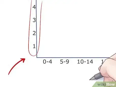
3Measure out the vertical axis. The vertical axis in a histogram is always for frequency. What measure of time is necessary, though, is up to your data of course (but the numbers will still need to be equally spaced). Just be sure to leave extra room at the top to make your chart easier to read.[2]
- If the upper limit of your histogram is 54, for example, you should make the highest number on the axis 60.
- If the frequency doesn't start until a fairly high number, you can cut out many of the numbers below it. For example, if the first frequency is 32, you can start the chart at 25 or 30.
-
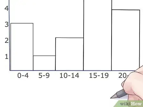
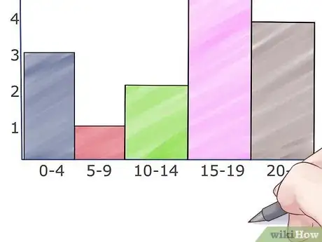
4Draw the bars. Draw the horizontal top line for each interval or group lightly, at the level that data was measured. Then, draw in the bars centered over the data point they represent. Make sure the bars are even and the same width as each other. Generally, histogram bars are supposed to touch, but if you have no results for a particular group, then don't worry about it.[3]
-
5Add some color. Add different colors to the histogram rectangles with colored pencils, markers, or crayons to help differentiate among the intervals.
Using Excel
-
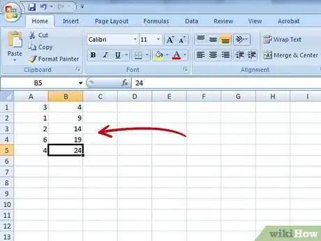
1Fill out your data. In an open Excel document, fill the second column with the "bins", or data groups that you want (20/30/40, 0/5/10/15, etc) with one group per cell. Fill the first column with the frequency of results for that group (called the grade), or the levels that you want the bars for that group to be at.
-
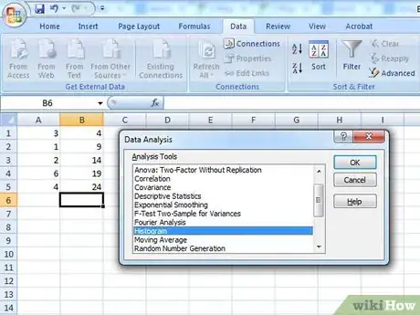
2Do a data analysis. Click Tools → Data Analysis. This is not always a standard feature in Excel so you may need to install it using the Add-ins option.[4]
-
3Select histogram. Select the histogram option in the Data Analysis menu and then click OK.[5]
-
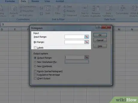
4Adjust your input and bin ranges. You will need to use the menu to select which column is which.[6]
-
5Select chart output. Select the chart output button and then press OK.
-
6Done! Enjoy your chart. Don't forget to save it.
Using an Online Program
-
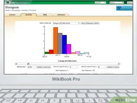
1Go to a website which generates histograms. We recommend using this one.
-
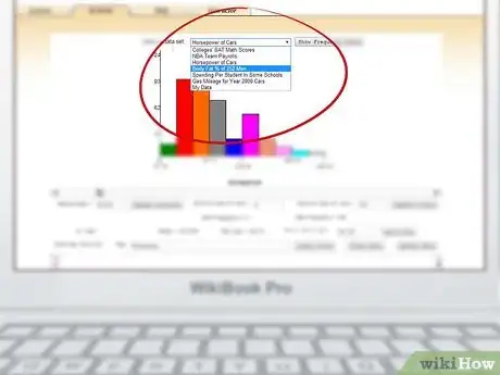
2Choose a preset format. There is a drop down menu at the top of the chart that gives you a few basic sample charts that you can fill with your own data. Alternatively, you can build one completely from scratch.
-
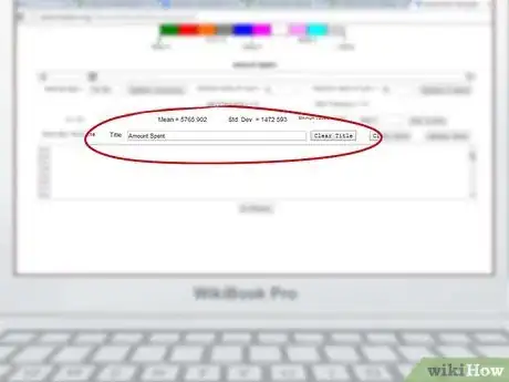
3Name the chart. You will see a box labeled "Title" towards the middle of the page. You should title your chart there.
-
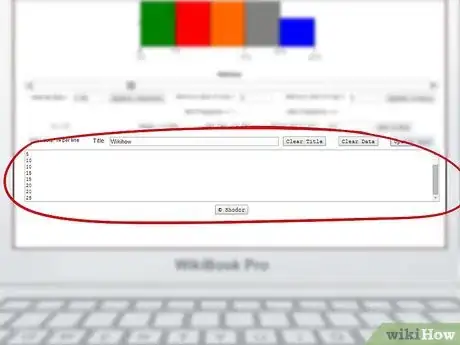
4Enter your data in the box at the bottom. You will see a large box below the title bar, towards the bottom of the page. Enter each data point that you have, with one data point per line (so...5, 5, 5, 10, 10, 15, 15, 20, 20, 25, etc).
-
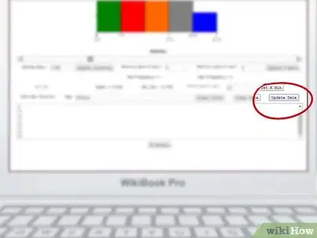
5Click Update Data. Click the Update Data button above the data box.
-
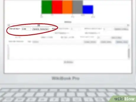
6Adjust the frequency. The chart should automatically adjust to your data, but you can also manually set the interval size and the maximums and minimums for the axes.
-
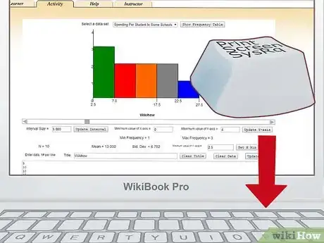
7Print or save your chart. Use the print screen function on your keyboard to take a picture of the completed graph. Paste and crop the image in MS Paint or whatever basic image software came with your computer. Save the image and print it if you want to.
Community Q&A
-
QuestionHow do I know how high to put my bars?
 Community AnswerThe bars go as high as the values you have. So, if you're representing people's favorite colors and 5 people like blue, the bar representing blue has to be 5 units high of whatever scale you're using.
 -
QuestionDo you always have to use a piece of graph paper, or is using a piece of plain paper okay as well?
 Dhruvi The starCommunity AnswerA piece of plain paper is also okay but the measurements should be accurate. A graph paper will be more detailed and specific.
Things You'll Need
- Graph paper
- Ruler
- Pencil
- Colored pencils, markers, or crayons
References
- ↑ https://www.bbc.co.uk/bitesize/guides/zspfcwx/revision/1
- ↑ https://flexbooks.ck12.org/cbook/ck-12-cbse-maths-class-8/section/14.3/primary/lesson/histograms/
- ↑ https://online.stat.psu.edu/stat500/lesson/1/1.6/1.6.2
- ↑ https://support.microsoft.com/en-us/topic/create-a-histogram-in-excel-a15d4de8-a432-72cd-9434-1a7f3e88698e
- ↑ https://support.microsoft.com/en-us/topic/create-a-histogram-in-excel-a15d4de8-a432-72cd-9434-1a7f3e88698e
- ↑ https://support.microsoft.com/en-us/topic/create-a-histogram-in-excel-a15d4de8-a432-72cd-9434-1a7f3e88698e
About This Article
To draw a histogram, start by using a ruler to draw your X and Y axes. Then, divide your range of values into “bins,” or data groups, and place them evenly along the horizontal X axis so that all the bars touch. The Y axis in a histogram always refers to frequency, so put your highest frequency toward the top of the Y axis, then space out the lower frequencies evenly along the Y axis. For each “bin,” draw a line where the frequency is measured, then draw and color in a vertical bar centered on the “bin.” To learn how to use Excel to make a histogram, keep reading!
