This article was co-authored by Renée Plevy and by wikiHow staff writer, Luke Smith, MFA. Renée Plevy is an Internationally Acclaimed Portrait Artist from New York/Palm Beach who has painted The Grand Dames of Palm Beach and various celebrities and community leaders. With over 50 years of experience, Renée specializes in painting realistically in oil and capturing the soul of the person. She has studied under internationally renowned portrait artists John Howard Sanden, David Leffel, Robert Beverly Hale, Clyde Smith, and Leonid Gervits. Renée is featured in over 68 shows and galleries including a one-woman museum show at the Paterson Museum. She has garnered numerous awards including “Artist of the Year” from The Bloomfield Art League and First Prize from the Boca Raton Museum Artist’s Guild. Renée has even painted a portrait of celebrity, Vanilla Ice. She also teaches at the Boca Raton Museum Art School - formerly at SVA in Manhattan.
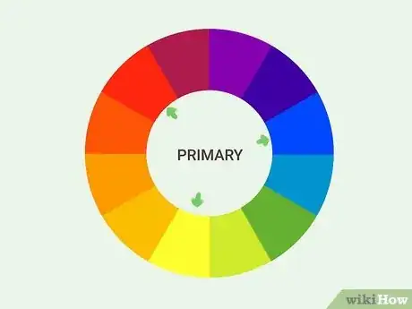
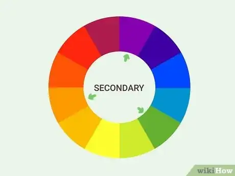
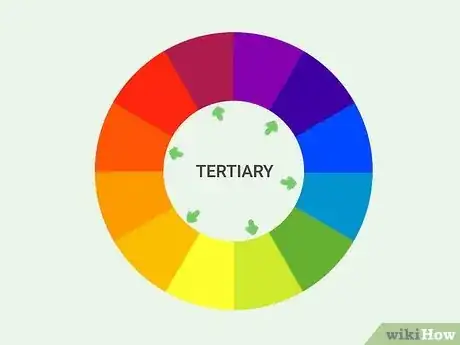
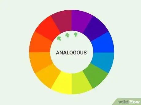
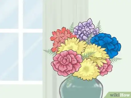
There’s plenty to consider when arranging flowers, and color stands as maybe the most important aspect. But the primary colors—red, blue, and yellow—are sometimes a bit tricky to incorporate into the perfect bouquet. They’re bold, vibrant, and maybe a little too dominating. But that doesn’t mean they can’t make a centerpiece worthy of royalty! With some help from the color wheel, these basic colors can produce complex and striking arrangements. First, we’ll fill you in on some basic color theory and tell you about the types of colors and their combinations. Then, we’ll give some handy primary color arrangement suggestions to get you started. You’ll be a primary-color pro in no time!
Things You Should Know
- Use red flowers as the centerpiece of your arrangement, surrounded by flowers of analogous colors like orange or orange-red.
- Arrange blue flowers with flowers of other blue hues, or pair them with vivid yellows for bouquets with striking contrasts.
- Use yellow flowers to brighten the mood of any bouquet, providing a warm tone to deeper red or orange bouquets.
Steps
Primary Color Arrangement Ideas
-
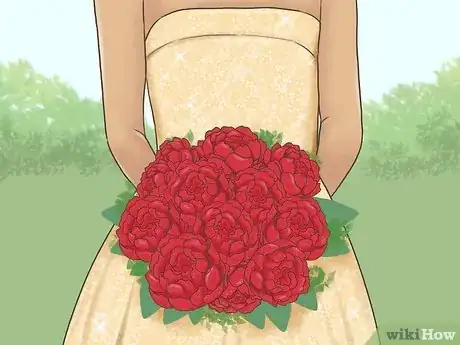
1Use red flowers as the dominant color in an arrangement. Now that you know a little about colors, use color theory in your arrangements! Red is a bold, commanding color that tends to attract immediate attention.[9] That’s why it’s best used as the base color in an arrangement, with supporting flowers in complementary or analogous combinations.
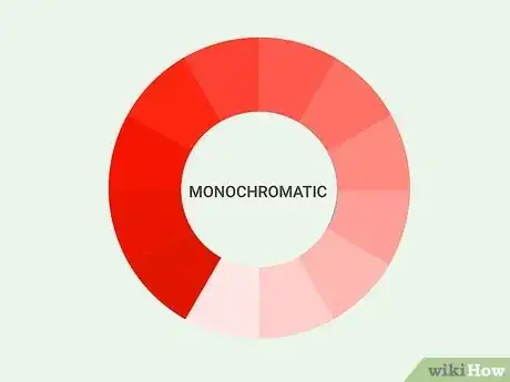
- A monochromatic bouquet of red roses is sure to be the centerpiece of any room it's in.
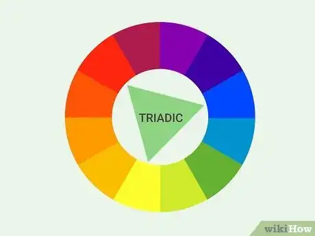
- Alternatively, red looks great when paired with analogous colors. Red lilies bunched with supporting orange-red and orange flowers like begonias, chrysanthemums, or marigolds make for a fiery, vibrant arrangement.
- In addition, include plenty of greenery like broad-leafed plants to provide red’s complementary color, green, to the bouquet.
-
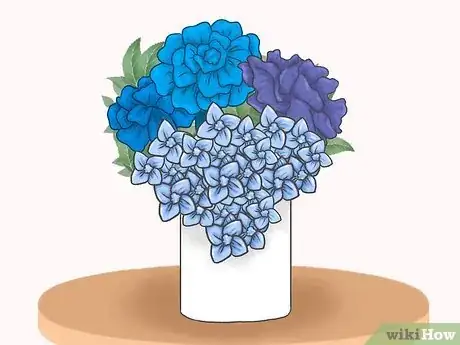
2Use blue flowers in monochromatic or analogous color arrangements. Blue tones tend to inspire feelings of calm and comfort.[10] When blue tones are paired with other blue tones, or other analogous colors like purples or teals, they make for a deep and hypnotic bouquet worth staring at for hours.
- Alternatively, pairing blue flowers with complementary oranges or even yellows can make the yellow flowers really pop. Surround a few big, bold yellow flowers, like sunflowers, with softer, cascading blue flowers, like lilacs.
-
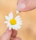
3Use yellow flowers to lift the overall mood of a bouquet. Yellow colors bring to mind happiness and warmth, and tend to suggest sunny dispositions.[11] Yellow flowers like daisies, daffodils, or zinnias add some cheer to warm, analogous arrangements of reds and oranges.
- Alternatively, yellow flowers tend to really pop when paired with complementary purple flowers like lilacs or irises.
References
- ↑ https://www.colormatters.com/color-and-design/basic-color-theory
- ↑ https://www.colormatters.com/color-and-design/basic-color-theory
- ↑ https://colors.dopely.top/inside-colors/color-theory-basis-everything-about-color-wheel/
- ↑ https://colors.dopely.top/inside-colors/color-theory-basis-everything-about-color-wheel/
- ↑ https://www.colormatters.com/color-and-design/basic-color-theory
- ↑ https://xd.adobe.com/ideas/process/ui-design/what-is-color-theory/
- ↑ https://colors.dopely.top/inside-colors/color-theory-basis-everything-about-color-wheel/
- ↑ https://colors.dopely.top/inside-colors/color-theory-basis-everything-about-color-wheel/
- ↑ https://xd.adobe.com/ideas/process/ui-design/what-is-color-theory/
