This article was co-authored by wikiHow Staff. Our trained team of editors and researchers validate articles for accuracy and comprehensiveness. wikiHow's Content Management Team carefully monitors the work from our editorial staff to ensure that each article is backed by trusted research and meets our high quality standards.
There are 7 references cited in this article, which can be found at the bottom of the page.
This article has been viewed 146,403 times.
Learn more...
Vexillography is the art of designing flags. A good flag is simple, meaningful, and easy to recognize. Flags can be used to represent cities, states, countries, organizations, and even movements. They have a way of bringing people together under a series of symbols and colours. In order to design a flag, you should decide on the basic layout, add symbolism, and keep it simple.
Steps
Deciding on the Basic Layout
-
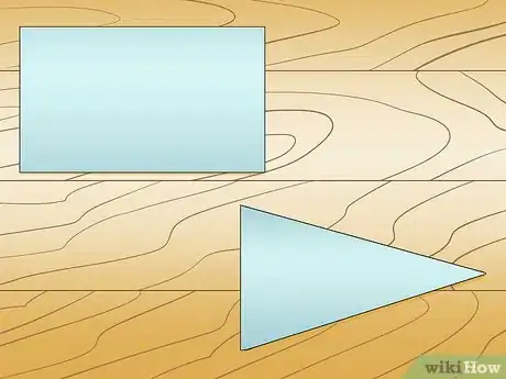
1Choose the shape for your flag. Most flags are either rectangular or square. Your flag doesn't have to be rectangular, but you should stick to simple shapes that are easy to see from a distance. For example, Nepal’s flag is made of two overlapping triangles.[1]
- Consider what you will be using your flag for. A triangle will work well for a pennant flat, while a rectangle will work for a sports flag, or the flag of a fictional country.
- In general, rectangles are the easiest shape to work with because they give you the most space to create your design on, and the majority of modern flags are rectangles.
-
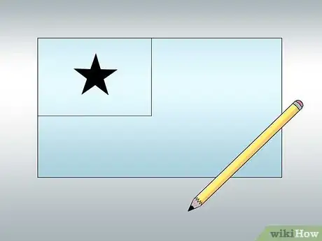
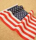
2Choose a simple, but memorable design. Some of the most common flag designs are bicolors, tricolors, and quarters, or use stripes, panels, and borders. The flag can also be a solid color with a unique symbol in the center. Alternatively, you can place a rectangle in the upper left hand corner called a canton (like on the American flag) that includes a symbol.
- You could create a symmetrical flag, like Japan's flag, or an asymmetrical flag, like Norway's flag.
- Look at flags for other countries and sports teams to get ideas. A good rule of thumb is be related, or be distinct. An example of related flags are flags with the Nordic cross, such as Sweden, Denmark, Finland, Iceland, Norway, and more.
- If you really want a detailed flag, take a look at some of the state and community flags. Note that many state flags are considered bad or poorly made.
Advertisement -
3Use 2 to 3 colors. As a general rule, you should only use 2 to 3 colors in your flag design. If you use more they can be hard to distinguish. The most common colors found on flags are black, blue, green, red, white, and yellow. You can use light and dark colors to create contrast. Relating colors can be useful, such as using colors next to each other on the color wheel, but may make it blend together. Complimentary and distinct colors work better. Depending on the tone, you may want to saturate it a lot, or only slightly. [2]
- You do not need to stick to the most popular colors. Instead, choose a color that symbolizes the place or organization your flag represents.
- Avoid colors that are too similar to each other, such as red and orange or navy and dark purple. They won't stand out as well.
Adding Symbolism
-
1Decide what you want your flag to represent. When you are designing a flag it is very important that you choose colors and images that symbolize the organization or place your flag represents. For instance, you may be designing a flag for a micronation, fictional land, club, organization, or charity. Keep this in mind when you are adding symbolism to your flag. Also note that a flag for a chess club will be much different in rules and design to a flag for a fictional country.
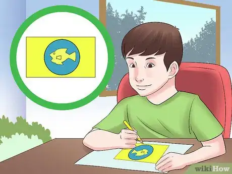
- For example, if you are creating a flag for a fishing club, you may want to use a fishing rod, boat, or fish as a symbol. The color blue could also be used to represent water.
-
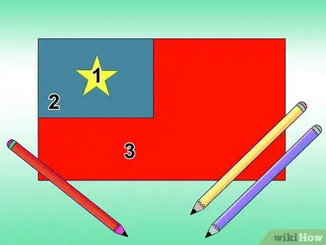
2Choose colors that have meaning. When you are selecting which colors to include on your flag, make sure the colors have some sort of symbolic meaning. For example, if your location is near water, you may want to include blue in your flag to symbolize the water. Consider some of the meanings associated with popular flag colors:[3]
- Black: determination, ethnic heritage, bravery, and/or defeating one's enemies.
- Blue: freedom, vigilance, perseverance, loyalty, justice, prosperity, peace, patriotism, water.
- Green: the Earth, agriculture, luck, and/or fertility.
- Red: courage, communism, revolution, hardiness, blood, and/or valor.
- White: peace, purity, snow, and/or innocence.
- Yellow: the sun, wealth, and/or justice.
- Pink: feminism.
- Gray: selflessness.
-
3Add an image. Images and symbols can be used to help distinguish your flag from others, and will communicate the purpose or meaning behind the flag. The image of an eagle could symbolize freedom or power, a star could stand for divinity or honor, and a circle could represent the sun.[4]
- The Japanese flag, for instance, has a plain white background with a red circle in the middle. This represents the sun, which is an important symbol in Japanese culture.
- Create your own meaningful symbol. For example, holding hands can symbolize friendship or teamwork.
Keeping it Simple
-
1Don’t include lettering on a flag. Lettering is not necessary on a flag. The colours and symbols on the flag should be enough to identify what the flag is representing. Lettering is also difficult to read from a distance and will look backwards if viewed from the opposite side. But, you can break this rule and still have a great flag. An example is Colorado's flag. [5]
- Flags are often hung up high and can flap in the breeze. As a result, lettering of any kind will be difficult to read.
- If you must include lettering, make it visible. For example, California's state flag has the words "California Republic" written in bold, brown letters on a white background.
-
2Decide on a design that is easy to draw. The best flag designs are those that are easy to draw. Do not include a complex seal or emblem on your flag. This will make it difficult to reproduce. Flag designs should be simple enough for a child to draw from memory.[6]
- You can still have a more detailed image on your flag, like the grizzly bear on California's state flag. The overall shape should be simple, however. Stylization is your friend here.
- A great way to create easy designs is to use stencils, cookie cutters, or clip art.
-
3Use a flag design app. If you have been tasked with designing a flag, but don’t know where to start, you can try using a flag design app to give you ideas for different basic designs and symbols. Search online for a flag design app.[7]
- Alternatively, you can use an image editing program, such as Photoshop or Microsoft Paint. These programs often come with basic shapes and lettering, ideal for flags.
Community Q&A
-
QuestionWhat if you are designing one just for fun?
 Community AnswerThen you'd still use these steps. If you want to make a 'just-for-fun' flag though, then just won't need to be as accurate or careful, unless you want to, of course.
 -
QuestionI need to design a flag with white and blue color. It's a country with a little population in a forest where coffee and tea is the main source of income.
 Community AnswerConsider doing a triangle in blue on one half and triangle in white on the other half. Place a stem of the coffee plant in the middle facing one way diagonally, then form a cross over this with a stem of a tea plant facing the other way. Keep the stems pictorially basic and easy to reproduce, if possible.
 -
QuestionHow do I choose the colors?
 Community AnswerChoose colors according to your flag's design. Don't just use dark colors -- be creative and add colors according to the features of the place you are making the flag for.
Warnings
- Don't make the obverse (front) side different than the reverse side, as this will be more expensive.⧼thumbs_response⧽
- Remember that the more complicated your flag is, the more expensive it will be if you want it to be made into a real flag.⧼thumbs_response⧽
- Don't put a seal or coat of arms on your flag. This makes it too complicated. Keep your symbol nice and simple.⧼thumbs_response⧽
References
- ↑ https://www.youtube.com/watch?v=7ykAy2OrCWo
- ↑ https://portlandflag.org/good-flag-bad-flag/
- ↑ http://www.enchantedlearning.com/geography/flags/colors.shtml
- ↑ https://www.youtube.com/watch?v=tENhOnfD82M
- ↑ http://ideas.ted.com/7-fantastic-flags-that-break-every-design-rule/
- ↑ http://ideas.ted.com/7-fantastic-flags-that-break-every-design-rule/
- ↑ http://flag-designer.appspot.com/#d=0&c1=0&c2=1&c3=3&o=6&c4=2&s=16&c5=0
- ↑ http://www.ausflag.com.au/assets/images/good-Flag-Bad-Flag.pdf
About This Article
To design a flag, start by choosing a shape for your flag, such as a rectangle or square. Next, decide what your flag should represent and create a basic design that incorporates your chosen symbolism. You can use stripes, panels, borders, symbols, images, or any other elements you like for your design. Finally, choose 2-3 meaningful colors for your flag that aren't too similar to each other so that your flag will stand out. For tips on choosing symbols for different kinds of flags, read on!
