This article was co-authored by wikiHow Staff. Our trained team of editors and researchers validate articles for accuracy and comprehensiveness. wikiHow's Content Management Team carefully monitors the work from our editorial staff to ensure that each article is backed by trusted research and meets our high quality standards.
There are 9 references cited in this article, which can be found at the bottom of the page.
wikiHow marks an article as reader-approved once it receives enough positive feedback. In this case, 83% of readers who voted found the article helpful, earning it our reader-approved status.
This article has been viewed 134,107 times.
Learn more...
Creating an attractive comic book cover is necessary to draw people into your comics and capture their interest. The best design for your cover art will incorporate elements of composition, psychology, and technique. You'll need the artwork to be clean, balanced, true to the content of your story, and also alluring. But all the hard work you put into the cover of your comic will be worth it when you notice an increase in readership or sales.
Steps
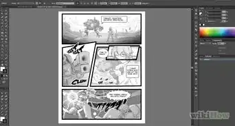
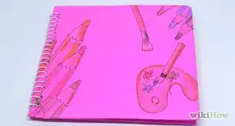
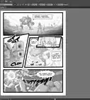
Sample Comic Book
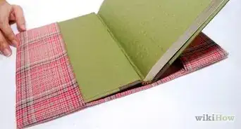
Choosing Your Cover Art Paper
-
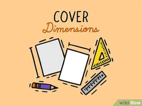
1Determine your cover dimensions. Though the standard size of most comic books is 6.625” by 10.25” (16.8 by 26 cm), custom sizes are available for special projects or printings.[1]
- If you are producing a graphic novel, there is much more flexibility with sizing, though the most common sizes are 5.5” by 8.5” (14 by 21.6 cm) or 6” by 9” (15.2 by 22.7 cm).
- If you are making a Japanese manga, the most popular sizes are: 5.04" by 7.17" (12.8 by 18.2 cm) and 5.83" by 8.2" (14.8 by 21.0 cm).
-
2Choose the best finish for the paper of your cover. You may have noticed that the paper used in comic book covers is heavier and of different quality than paper you might use in your home printer. These different kinds of paper allow the illustrations to be communicated on the page more clearly on the page and while holding up to wear and tear. The three main kinds of finish you'll need to decide between are:[2] [3]
- Gloss finish, which is the brightest and shiniest finish; ideal for highlighting the images on your cover.
- Matte finish, less bright and reflective than gloss, but still somewhat reflective. Matte can save you money on printing costs while providing a quality cover.
- Uncoated paper, which is the flattest finish in terms of sheen. It has a natural appearance and is most frequently used for the inner pages of the comic.
Advertisement -
3Pick the weight of your paper. In addition to finish, the thickness of your paper will influence the durability of your finished comic. The standard weight for printer paper is between 20 and 24 lbs (9 - 10.9 kg), though this is often too light a weight for a comic. Thinner paper runs the risk of not having enough substance to prevent bleed through from the illustrations contained in your comic.
- The inner pages of comics are often printed on 60 or 70 lb (27.2 or 31.8 kg) weight paper. Though there is not a set standard for the ideal thickness of your cover, cover pages are generally thicker than the pages on the inside of the book.[4]
-
4Investigate printing options. Different printing companies specialize in different kinds of printing. A standard business printer might not be able to provide the quality or have the materials on hand to produce your cover art in the way you've decided, so be clear about your expectations. Higher quality at-home printers, on the other hand, can be a cost efficient solution for smaller projects.
- Printing costs vary considerably between companies. You should shop around and get several quotes for your printing before deciding on a printer.
Planning Your Cover
-
1Plan a "hook" for your cover. This can be either in the images on your cover or in the title itself. In either case, you'll want readers to be interested in buying your comic book, and a time-tested technique for catching readers' attention is to include a cover image that ignites interest or sparks questions.
- For example, a picture of your hero in a difficult situation might make potential readers think, "How does he get out of that?" To answer the questions, they'll have to buy your book![5]
-
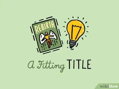
2Decide upon a fitting title. You'll want a title that both catches eyes and faithfully conveys an important aspect of the story of your comic. You might choose a title that reflects the main action of your comic, you might decide upon a title that hints at deeper conflict or emotional turmoil, or your title might be suited for a clever pun.[6]
- A comeback story might be titled "Rebirth" or "The Phoenix Rises."
- An epic battle might be captured by titles like "Bloodshed Battlefield" or "Skirmish in the Snow."
- Emotional plot lines could be expressed by titles like "The Conflict Within" or "The Chaos of the Mind."
-
3Link your title with the cover art. A title that doesn't seem connected to the images surrounding it can leave potential readers unsure if your book is one they are interested in buying. The title and artwork should work together to summarize the subject matter of your book.
- As an example, a comic titled "Fighter" should probably have some kind of fighting sequence depicted on its cover.
-
4Correlate the tone and quality of your comic with cover art. A significant portion of tone in comics is conveyed by the style of the artwork. Cover art that is significantly different from what is inside your comic can leave readers feeling cheated. You'll want to be sure that your cover art corresponds to the quality and tone of the art in your comic.
- The tone of your comic can be expressed through genre features. For example, noir artwork will be gritty with shadows, while fantasy will be more lustrous and wondrous.
-
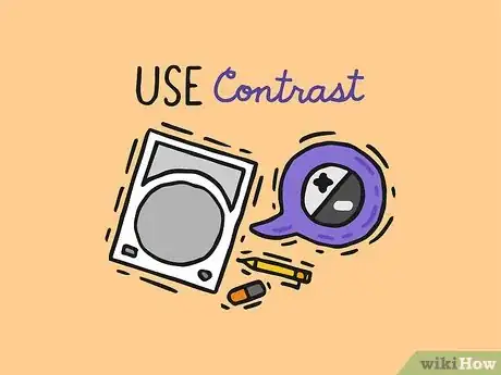
5Use contrast to highlight your cover content. Shapes inscribed on your cover page can bring out contrast or add to the framing of the scene. As the shape of your cover page will most likely be square, the shape that offers the most contrast is the circle, though you might find other shapes layered in the background can give pop to your cover art.
- You might also consider using the border of the page to frame the cover art, giving the impression of peeking in on a scene to the reader.[7]
-
6Distribute characters to illustrate roles. If, in your story, you have a hero facing off against against a villain, you can do a classic "versus" pose, where you put the two characters in an antagonistic posture on opposite sides of the page.
- You might also gather associated characters together, putting "good" characters on the right and bad guys on the left, for instance.
- Another popular layout is to have the heroes in the front, and the villain's oversized face looming ominously in the background.
-
7Depict large groups of characters to show scale. Character heavy comics can make cover art feel overcrowded. If you intend on showing a large group of characters, or maybe even an army battle sequence, on your cover, you may want to draw the figures in smaller scale.
- This way, you can give a sense of largeness to the scene and incorporate more of the setting, creating greater balance between the figures and their surroundings.[8]
-
8Place a looming image in the background to create an ominous tone. A semi-transparent image in the background, looming over heroes, has been used in many comics to indicate the watchful eyes of a villain. In a more general sense, this technique can add an element of the foreboding to your cover art, which might be just what you need.
- You may be able to create this technique by hand, but it may be easier to do it digitally with 2 separate layers.
-
9Break the fourth wall to give a 3D effect. By using shading and perspective, you can make your characters appear as though they're breaking out of or into the space of your cover page. This illusion of depth can literally draw your readers into the story, making them feel immersed in your story from the outset.[9]
Implementing Your Design
-
1Hire an artist or assistant, if necessary. In the event you are the illustrator of the comic, you may not need to hire an illustrator. However, you still might benefit from hiring an assistant, like an inker to complete the line work you do on your own. This can help your project finish in the most timely fashion possible.[10]
- Some comic book artists like to make the cover art more intricate than what is on the inside of the comic. For example, the comic may be in black-and-white, but the cover may be in color.
-
2Gather your materials. Depending on the medium in which you've decided to draw your comic, these materials may be drastically different. You should be able to purchase the majority of your supplies at your local art store, and a list of common art supplies you might use includes:
- Colored pencils (optional; for coloring)
- Computer (optional; for coloring)
- Markers (optional; for coloring)
- Paper
- Pencils
- Pens (for inking)
- Scanner (optional; for digital coloring)
-
3Sketch a rough draft. A reference for the finished design will help prevent you from forgetting a part of it. A rough draft will also give you a better feeling for the composition of the scene, giving you a second chance to rebalance your cover art before working on the real thing.[11]
- Sometimes, a single rough draft may not be enough. Create several rough drafts, then choose the one that looks the best.
-
4Pencil your cover art characters and title. Take your paper and pencils and do a preliminary sketch of your characters. Once the rough design for the cover panel is on the page, you can start cleaning up your lines and penciling in details.
- At this stage, you might also want to include your name and the names of others involved in your project.[12]
-
5Rough out your background for the cover scene. You might have chosen a setting right from the inside pages of your story, but you could also use settings hinted at in the dialogue of your comic. In the same fashion as your character preliminary sketches, you will also:
- Draw your rough background images
- Clean up your lines to create a clean image.
- Add details and fill out the illustration.[13]
-
6Ink your penciled lines. Professional comic production teams often have one or more individuals dedicated to this task. During the inking process, you will need to use ink to finalize the penciled line work. Beyond that, while inking you should:
- Correct any errors or inconsistencies in the penciling.
- Utilize shading techniques to create an interplay of shadow and light in the composition.[14]
-
7Color your cover art. This is typically the final stage in comic creation process. Many contemporary artists will scan the inked design and use a computer for coloring, but some artists still prefer physical media. Your key goal at this point is to create coloring that does not detract from the line work.[15]
- If you are coloring your artwork traditionally rather than digitally, you may need to go over some of your line art again to make it sharper.
-
8Print your finished work. The route you take in printing will depend on whether you've decided to send your book to a professional printing agency or do the job yourself. A quality home printer, hard work, and a significant time investment can save you money, but a printing agency has the process necessary for better consistency and larger scale projects.
- Some printing agencies may require you to provide a digital copy for printing. In this case, you may need to take a high resolution scan of your cover art.
Community Q&A
-
QuestionWhat about if I were to put a team on the cover and didn't want it to look bland, what options would I have?
 William ClaridgeCommunity AnswerLike it said above, show a part of the comic that shows the team in danger, or a huge scene that happens. You want the reader to hooked on it just by a glance at the cover.
 -
QuestionHow do I make the coloring on the cover look professional?
 Community AnswerLearning to color simply takes time and practice. Look up tutorials and get a feel for whatever medium you use with smaller pieces before coloring big projects like a comic.
 -
QuestionWhat kind of pens do you use to trace artwork?
 Kwaiicookie101Community AnswerTrace sketches with ball point pens, but it's up to you, it doesn't really matter just use a dark pen but make sure it doesn't bleed through.
References
- ↑ http://www.mmprint.com/blog/2015/the-basics-of-designing-and-self-publishing-your-independent-comic-book-2/
- ↑ http://www.mmprint.com/blog/2015/the-basics-of-designing-and-self-publishing-your-independent-comic-book-2/
- ↑ http://designinstruct.com/print-design/print-finishes/
- ↑ http://www.mmprint.com/blog/2015/the-basics-of-designing-and-self-publishing-your-independent-comic-book-2/
- ↑ http://www.forbes.com/sites/carminegallo/2016/02/16/how-storytelling-hooks-your-audience/#6615eb32321a
- ↑ http://www.writing-world.com/fiction/titles.shtml
- ↑ https://www.canva.com/learn/magazine-cover-design/
- ↑ http://www.webdesignerdepot.com/2011/02/common-design-styles-used-in-album-artwork/
- ↑ http://www.webdesignerdepot.com/2011/02/common-design-styles-used-in-album-artwork/
- ↑ http://www.makingcomics.com/2014/01/16/overview-comic-creation-process/
- ↑ http://www.makingcomics.com/2014/01/16/overview-comic-creation-process/
- ↑ http://www.lackadaisycats.com/makingacomic.php
- ↑ http://www.makingcomics.com/2014/01/16/overview-comic-creation-process/
- ↑ http://www.minnasundberg.fi/walkthrough_inking.php
- ↑ http://www.makingcomics.com/2014/01/16/overview-comic-creation-process/

