This article was co-authored by wikiHow staff writer, Jennifer Mueller, JD. Jennifer Mueller is a wikiHow Content Creator. She specializes in reviewing, fact-checking, and evaluating wikiHow's content to ensure thoroughness and accuracy. Jennifer holds a JD from Indiana University Maurer School of Law in 2006.
wikiHow marks an article as reader-approved once it receives enough positive feedback. This article received 12 testimonials and 95% of readers who voted found it helpful, earning it our reader-approved status.
This article has been viewed 303,961 times.
Learn more...
Forex is the global foreign exchange market where foreign currencies are bought and sold. The market uses currency pairs to evaluate the relative strength of one currency against another. The pairings show how much of the second currency (the quote) you can buy for one unit of the first currency (the base). Forex traders use forex charts to evaluate movement in currency pairs and predict trends. If you correctly identify a trend, you can potentially Make Money in Forex turn a profit buying and selling in Forex. There are 3 types of Forex charts that are the most popular among traders: Candlestick charts, line charts, and bar charts.[1]
Steps
Candlestick Charts
-
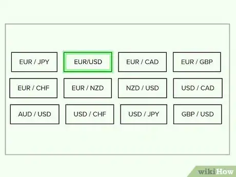
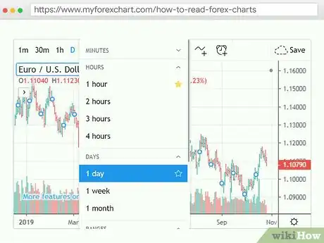
1Pick the currency pairing you want to evaluate. Currencies are always traded in pairs on Forex. When you choose a currency pair, for example, EUR/USD, the chart you generate will show you how many US dollars you can buy for one Euro.[2]
- You can test the relative strength of a particular currency by looking at several different pairings.
- The various pairs available depend on the Forex service you're using. You can pull up charts for major pairs, such as EUR/USD. You also often have the option of looking at minor pairs as well, such as AUD/CAD (the relationship between the Australian Dollar and the Canadian Dollar).
-
2Determine the time period you want to be displayed. Your chart shows how the exchange rate between the two currencies changed over time. In a candlestick chart, each candlestick accounts for a specific time period you set. You also set the overall time period, which determines how many candlesticks you have.[3]
- For example, you could set your overall chart to show a 24-hour period, with each candlestick representing one hour. Each candlestick shows the opening price at the beginning of the hour and the closing price at the end of the hour, as well as the high and low price during that period. Since you chose a 24-hour period, you would have 24 candlesticks total.
- The position of the candlesticks on the graph shows the fluctuations in the exchange rate between the two currencies over the period of time you've chosen. The time period is expressed in intervals along the Y-axis and the exchange rate is charted along the X-axis.
Advertisement -
3Distinguish bullish candles from bearish candles. Generally, there are two types of candles: a bullish candle and a bearish candle. On most candlestick charts, the bullish candle is open while the bearish candle is colored in. The differences are as follows:[4]
- If the closing price is higher than the opening price, you have a bullish candle.
- If the opening price is higher than the closing price, you have a bearish candle.
Tip: The coloration of bullish candles and bearish candles depends on the service generating the chart. Some use different colors, for example, bullish candles may be green and bearish candles may be red. Check the key of your chart to make sure you understand what the colors mean.
-
4Identify the parts of the candlestick. The top and bottom lines of the candle itself display the opening and closing exchange rate for the pairing you've chosen. You know which one is the opening and which is the closing by looking at the coloration of the candle body. Then you'll see lines extending from the top and bottom of the candle, giving rise to the name of the chart.[5]
- The highest point, at the tip of the wick, is the highest exchange rate for the pairing for the selected period.
- The lowest point, at the tip of the shadow, is the lowest exchange rate for the pairing for the selected period.
- On a bullish candle, the highest line of the candle will be the closing price, while the lowest line of the candle will be the opening price. For a bearish candle, the highest line would be the opening price and the lowest line would be the closing.
-
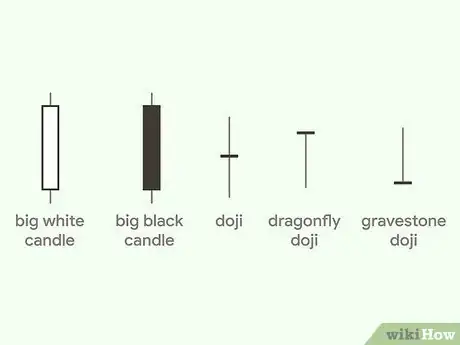
5Learn the names of candlestick patterns with predictive value. Part of what makes candlestick charts fun to read are the names given to different patterns. Once you learn to identify these patterns, you can more accurately predict which way the market is going to move for the pairing you're evaluating. Some patterns with predictive value are:[6]
- Big candles: A big candle body indicates a trend that is continuing for a longer period of time. If you see a large bullish candle, you know the bullish trend is continuing for that pairing. A large bearish candle indicates a continuing bearish trend. A bullish candle might signal you to buy that pairing, while a bearish candle would signal you to sell.
- Doji candles: Doji candles have little to no candle body. These indicate the market condition is neutral or tentative. Doji candles can tell you to hold off on either buying or selling that currency pairing.
-
6Place the patterns in context on the chart. Once you know how to identify types of candlesticks, look at their relative position on the chart. This helps you understand what that particular pattern is actually telling you about the way the market is moving.[7]
- For example, suppose you see a Doji candle with the candle line at the bottom of the formation so that there's a longer wick and no shadow. If you see that candle at the top of an uptrend, it may signal that the uptrend is reversing.
Tip: You can combine multiple candlesticks together to spot more complex candlestick patterns. Many of these have names as well. For example, 3 bullish candles together on an uptrend are known as "three white soldiers" and indicate that the exchange rate is steadily moving upward.
Line Charts
-
1Choose your currency pairing. Line charts don't show as much detail as either candlestick charts or bar charts. However, they can be good for identifying overall trends in the relationship between the two currencies. You can also pull up line charts for several pairings to get a sense of the overall strength of a particular currency.[8]
- For example, if you wanted to evaluate the strength of the US Dollar (USD), you might look at it paired with Euros (EUR), then with the Chinese Yuan (CNY), then with the Japanese Yen (JPY).
Tip: Looking at line charts for several major pairings can help you better understand the overall market and any general market trends.
-
2Set your time period. Since you're typically looking at a bigger picture with line charts, you may want to set a longer time period for your line chart. The maximum length of time you can set depends on the service you're using to generate your chart.[9]
- Since line charts only compare a single value at a time, a longer period can help you see large-scale patterns that you wouldn't see on charts that only analyzed a shorter time period.
-
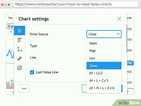
3Determine which price you want to use. Most line charts use closing prices as a default. However, depending on the service you use, you may be able to generate a line chart comparing another value, such as high, low, or opening prices.[10]
- If you compare multiple line charts, they can give you a better idea of exchange rate movement. For example, you could compare a line chart of high prices with a line chart of low prices for the same period. Significant differences between the two lines would indicate volatility in the exchange rate for that particular pairing.
-
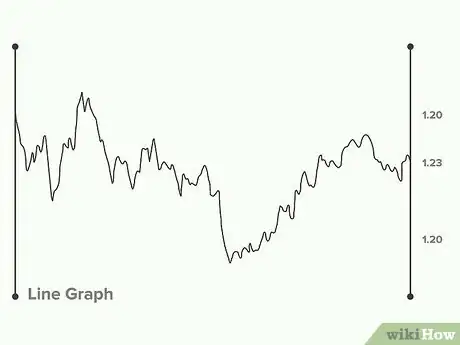
4Evaluate the trend represented by the line. Unlike candlestick charts or bar charts, with line charts, you want to look at the chart as a whole. While you'll typically see many ups and downs as you move along the X-axis, pay attention to whether the overall trend is for the exchange rate to increase or decrease.[11]
- This relatively simplistic view of overall rate movement can supplement your analysis on other charts. For example, if you've noted a down-trend in the last 24 hours, you could check on the line chart to determine whether the lowest point is down overall, or coming down from a spike.
Bar Charts
-
1Identify the currency pairing you want. As with candlestick charts and line charts, bar charts compare a single exchange rate between two different currencies. The rate tells you the amount of the second currency you could potentially buy for the first currency.[12]
- Bar charts represent the high, low, opening, and closing price for the interval represented by each bar. Unlike line charts, however, the bars are not connected to each other.
-
2Select your time period and intervals. The time period is represented by the Y-axis and is the entire period for which you're evaluating the exchange rate trend. The interval is the period represented by each bar on your chart.[13]
- For example, you could use hour-long intervals over the course of a day. Each bar would represent one hour and you would have 24 bars over the course of the day. The Y-axis would follow hour-long intervals so you could progress the movement of the exchange rate.
-
3Identify the high and low price for the interval. On a bar chart, the high price for the interval is the top of the vertical bar. The low price for the interval is defined by the bottom of the vertical bar.[14]
- The position of the bar relative to the bars before and after it gives you an idea of the overall trend for that pairing. For example, if the bars are moving steadily upwards, that indicates that the rate is increasing over time.
-
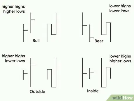
4Compare the opening and closing prices. A small horizontal line sticking out from the left side of the bar is the opening price. The small horizontal line sticking out from the right side of the bar is the closing price. By comparing their relative position on the vertical bar, you can determine whether the market was bearish or bullish during that interval.[15]
- If the open-price line to the left is higher than the closing-price line to the right, you have a bearish market for the pairing in that interval. In contrast, a higher closing-price line indicates a bullish market.
Tip: Some brokerages offer shades or colors for their bar charts, similar to candlestick charts, to make it easier for you to identify bearish and bullish intervals at a glance. Look for a key so you can understand what the shades and colors represent.
-
5Look for overall trends in the movement of the bars. Looking at your whole bar chart, you get a sense of the big-picture movement for the chosen currency pairing over the period you've selected. If your picture seems incomplete, you can adjust your time period to capture a larger period.[16]
- For example, if the overall chart appears to indicate an upward trend, you might want to go back further to see when that trend began.
- Using a bar chart is particularly helpful if you want to look for gaps in the exchange rate. These are spots where the bar for the first period doesn't overlap any part of the bar for the second period.[17]
Community Q&A
Did you know you can get answers researched by wikiHow Staff?
Unlock staff-researched answers by supporting wikiHow
-
QuestionHow do you use Forex signals?
 wikiHow Staff EditorThis answer was written by one of our trained team of researchers who validated it for accuracy and comprehensiveness.
Staff Answer wikiHow Staff EditorStaff AnswerForex signals are bits of information that you can get about the market from a signal service, such as an app, email alert service, or texting service. Some signals may simply provide information (such as current market prices), while others can advise you to take certain actions, like buying or selling. Get familiar with the format used by your chosen signal service so you know what the signals mean and how to use them.
 -
QuestionHow do you read Forex charts like a pro?
 wikiHow Staff EditorThis answer was written by one of our trained team of researchers who validated it for accuracy and comprehensiveness.
Staff Answer wikiHow Staff EditorStaff Answer
 -
QuestionHow do you predict Forex charts?
 wikiHow Staff EditorThis answer was written by one of our trained team of researchers who validated it for accuracy and comprehensiveness.
Staff Answer wikiHow Staff EditorStaff Answer
Warnings
- Like any trading, Forex trading is risky. The foreign exchange markets are affected by political, social, and environmental factors that are difficult to predict or manage. Never invest more on Forex than you could afford to lose.⧼thumbs_response⧽
References
- ↑ https://www.myforexchart.com/how-to-read-forex-charts
- ↑ https://www.myforexchart.com/how-to-read-forex-charts
- ↑ https://forextraininggroup.com/learn-read-forex-candlestick-charts-like-pro/
- ↑ https://forextraininggroup.com/learn-read-forex-candlestick-charts-like-pro/
- ↑ https://www.myforexchart.com/how-to-read-forex-charts
- ↑ https://forextraininggroup.com/learn-read-forex-candlestick-charts-like-pro/
- ↑ https://forextraininggroup.com/learn-read-forex-candlestick-charts-like-pro/
- ↑ https://www.babypips.com/learn/forex/types-of-charts
- ↑ https://www.benzinga.com/money/how-to-read-forex-charts/
- ↑ https://www.benzinga.com/money/how-to-read-forex-charts/
- ↑ https://www.benzinga.com/money/how-to-read-forex-charts/
- ↑ https://www.myforexchart.com/how-to-read-forex-charts
- ↑ https://www.benzinga.com/money/how-to-read-forex-charts/
- ↑ https://www.babypips.com/learn/forex/types-of-charts
- ↑ https://www.babypips.com/learn/forex/types-of-charts
- ↑ https://www.babypips.com/learn/forex/types-of-charts
- ↑ https://www.benzinga.com/money/how-to-read-forex-charts/
About This Article
A Forex chart is a visual way to read price movements over a certain period. When you're looking at a Forex chart, you'll see rectangular symbols that look like candles - these indicate opening price and closing price. For the black ones, the top is the open price and the bottom is the closing price. For the white ones, it's the opposite. The little "sticks" on the top and bottom of each candle indicate the highest and lowest price fluctuations during that time period. For more advice, like how to understand the different candlestick formations, read on.
