This article was co-authored by Vikas Agrawal. Vikas Agrawal is a Visual Content Marketing Expert & Entrepreneur, as well as the Founder of Full Service Creative Agency Infobrandz. With over 10 years of experience, he specializes in designing visually engaging content, such as infographics, videos, and e-books. He’s an expert in Making content marketing strategies and has contributed to and been featured in many publications including Forbes, Entrepreneur.com, and INC.com.
This article has been viewed 44,999 times.
Presentations can be nerve-wracking to give. You’re far more likely to walk into a board meeting with confidence if your writing and visuals are compelling. Take time to carefully compose your story, practice and make a slideshow that will impress your audience. Thankfully, there are plenty of modern tools and programs that provide beautiful presentation templates.
Steps
Writing a Presentation
-
1Create an outline before you start writing. Follow the traditional outline of introduction, evidence, insights and conclusion. Imagine you are writing a story and need to map out the plot.
-
2Use the rule of threes. Structure your report to respond to three aspects of the thing you are presenting or answer three questions, such as “what,” “why” and “how.” The human mind is set up to respond positively to three things in a list or in a presentation.Advertisement
-
3Tell a story or ask a question to get the audience thinking right away. This will help evoke a mental image and get them thinking critically about what you’re saying.
-
4Find the most compelling data. Balance that and then tell them why the data is important in each of your three sections. Remember, most of the data can be shown with visual aids, so don’t over report.
-
5Ask the audience questions. Instead of telling them the trends you see in the data, challenge them to find what the trends are telling the company. Build interaction into your presentation to avoid boring lectures.[1]
-
6Match the vocabulary and tone to your audience. Adjust your writing for each new audience you have. Research your audience so that you can better customize your presentation to their needs.
-
7Ensure there is good flow to your presentation. Practice it in front of a colleague or friend so that you can ask them what they’ve taken away from the presentation.
-
8Explain how your presentation or proposal adds value to the person’s life. The audience may only leave with this impression.[2]
-
9Keep it short and sweet. A shorter presentation is likely to be memorable. If the presentation is over 30 minutes, you should consider cutting it back or breaking it up into several chapters.
Creating Visual Aids
-
1Pick your platform strategically. If you don’t have a projection screen or you’re outside in full sunlight, a PowerPoint won’t be the best way to present your data. PowerPoint presentations are still the gold standard of the business world; however, you might be able to employ a laptop, a projector or even cell phones to ensure you are reaching your audience.
-
2Select a template that fits your audience. There’s very little reason to design your own template when so many slideshow programs give you compelling templates to choose from.
-
3Choose a consistent design. Consistency allows the listener to notice the information, rather than the way it’s presented. Don’t change colors, fonts or structure unnecessarily.[3]
-
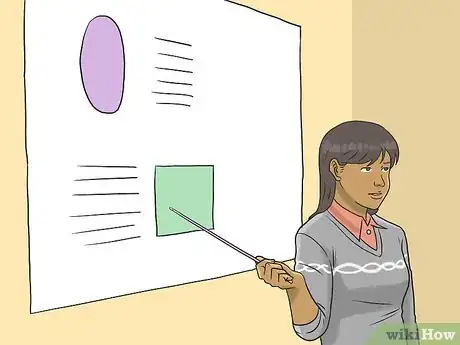
4Avoid excessive text in your slides. Use white space so that the audience’s attention is focused on particular data.
-
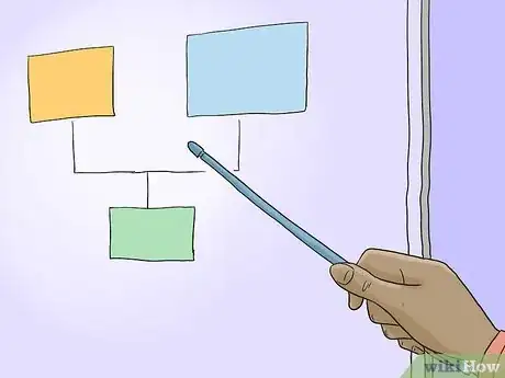
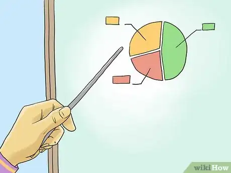
5Use graphs, charts and other visual tools, in place of bulleted lists whenever possible. Your speaking will provide the insights, so give the data in the most straightforward way.
-
6Try using infographics. This is a chart or graph that incorporates pictures with data and words to form a coherent, and very attractive, story. You may need to use an infographic service or hire a graphic designer.
- The more you visualize the text and information available in the presentation, the better impact it is going to create on the audience's mind.
-
7Use photographs that are relevant. Make sure you don’t simply use stock imagery. Any way you can tie in company or emotional images will create a better response.
-
8Focus on the slides themselves, rather than the music or transitions. These things can detract from a presentation, rather than add to it. A no frills approach is usually best.
-
9Proof your visuals. Ask someone else to proof them. Including typos or incorrect data will reflect poorly on you.[4]
Using Presentation Tools
-
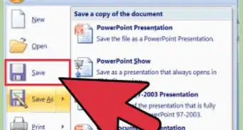
1Pick your slideshow program. PowerPoint is best if you are in a Windows-centric office and you need to share the presentation with others. Keynote is best in an Apple-centric environment.
- There are many more web-based services that you can use to develop your presentation. Some of these allow you to make and edit the presentation from a tablet or phone.
-
2Make your slideshow into a movie. If you want to be able to pull your presentation up at any time, post it online for easy access. Use capabilities like Apple’s Airplay to push a YouTube clip to a large Apple computer.
-
3Consider a web-based application if you plan to post your presentation to the web anyway. Services like Knovio allow you to add narration so that your presentation can be posted in its entirety.
-
4Try a canvas-based presentation maker, like Prezi. The newest presentation services allow you to use a more natural, story-like flow, so the presentation feels like navigating a website, rather than moving through slides.[5]
-
5Post your presentation (with narration) to Slideshare or a similar website. You will reach more people and your presentation may even go viral. Make sure you have your company’s permission before doing so.
-
6Share the Slideshare or movie link on social media. If you want a wider reach, then a good presentation can be shared using Facebook, Twitter and other outlets.
Expert Q&A
-
QuestionHow can I make my PPT more attractive?
 Vikas AgrawalVikas Agrawal is a Visual Content Marketing Expert & Entrepreneur, as well as the Founder of Full Service Creative Agency Infobrandz. With over 10 years of experience, he specializes in designing visually engaging content, such as infographics, videos, and e-books. He’s an expert in Making content marketing strategies and has contributed to and been featured in many publications including Forbes, Entrepreneur.com, and INC.com.
Visual Content Marketing Expert & Entrepreneur Try putting some motion graphics into your presentation—that'll make it look a lot more visually engaging. Videos, animated images, or LottieFiles are all great technologies you can use.
 -
QuestionCan I use Google Slides as PowerPoint?
 Vikas AgrawalVikas Agrawal is a Visual Content Marketing Expert & Entrepreneur, as well as the Founder of Full Service Creative Agency Infobrandz. With over 10 years of experience, he specializes in designing visually engaging content, such as infographics, videos, and e-books. He’s an expert in Making content marketing strategies and has contributed to and been featured in many publications including Forbes, Entrepreneur.com, and INC.com.
Visual Content Marketing Expert & Entrepreneur Absolutely! In fact, Google Slides is kind of becoming the next step of PowerPoint. In PowerPoint, there are a few limitations—for instance, with PPT, you need to have all the fonts installed in your PC to get the best editability. However, Google Slides is a cloud-based application, so you get a similar interface to PPT that your whole team can collaborate on at a single point in time.
Things You'll Need
- Desktop computer, laptop, tablet or phone
Expert Interview

Thanks for reading our article! If you'd like to learn more about making effective presentations, check out our in-depth interview with Vikas Agrawal.
References
- ↑ https://www.comm.pitt.edu/oral-comm-lab/audience-analysis
- ↑ https://www.hamilton.edu/academics/centers/oralcommunication/guides/how-to-engage-your-audience-and-keep-them-with-you
- ↑ https://www.washington.edu/doit/presentation-tips-0
- ↑ https://writingcenter.unc.edu/tips-and-tools/editing-and-proofreading/
- ↑ https://libguides.wilmu.edu/presentations
About This Article
To make a good presentation, use a lot of visuals, like graphs, charts, and infographics, to make your presentation more interesting. Also, if you're presenting a slideshow, avoid using a lot of text in your slides since it could overwhelm and bore your audience. Instead, leave plenty of white space and focus on one key point per slide. When you're giving your presentation, take time to explain why it's relevant to your audience or how it affects their lives, which will make them more interested in what you're saying. For tips on how to choose a presentation tool, like PowerPoint or Prezi, scroll down!


