X
wikiHow is a “wiki,” similar to Wikipedia, which means that many of our articles are co-written by multiple authors. To create this article, volunteer authors worked to edit and improve it over time.
This article has been viewed 13,276 times.
Learn more...
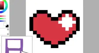
Pixel art is a style of digital art using close up pixels. It's a common feature of older or stylised retro video games. Whether or not you plan on using your artwork in a game, drawing a pixel art cake is a lot of fun. It'll look so tasty you'll wish you could eat the pixels right off your screen!
Steps
Method 1
Method 1 of 2:
Drawing a Whole Cake
-
1Draw two parallel lines. These will be the sides of the cake, so don't make them too close together or far apart. They need to be the same heights, as they will be the height of the cake.
-
2Attach an ellipse to the top of the lines. It shouldn't be too thick, or the cake won't look quite right, but if you make it super thin, it won't look like a cake anymore.Advertisement
-
3Copy the curve from the ellipse at the top on the end of the lines. You can copy and paste if the editor you're using allows it. Otherwise just do it by hand, preferably with a tool making what you draw symmetrical, so it appears on both sides.
-
4Add some toppings in. Draw in some berries, circles, decorations or whatever you think would look nice on top of the cylinder shape. These should go around the cake, to make sure it actually has the appearance of a cake and not just a cylinder with circles.
-
5Sketch in a squiggly line underneath the top ellipse. This is the icing. Some cakes have it drip all the way to the bottom of the cake, so there isn't really a limit to how big the curves should be for this cake.
-
6Repeat the ellipse's curve higher up on the cake. Do this twice so that the cake can have filling. If you can try moving around these curved lines, you can choose the position that looks best for your cake.
-
7Pick a colour palette. Using a paint bucket tool, fill in the cake with colours you think would look the tastiest. You can try a few palettes if you want, then choose the one you prefer to keep.
- If you are using more than one colour, try to match the colours in a way that would look appealing to eat. A brown, blue and yellow cake, for example, may not look very nice to eat, although it could, had you chosen the right shades.
-
8Highlight and shade the design. Now that the cake is coloured, you can add details and shading that makes it look a little more real, or at least have more depth.
- Highlights and shadows should correlate to each other, by not being in the same spots. For example, you wouldn't see a reflection of light on a cherry's shadow, but round the other side, so make sure that's how you draw it.
Advertisement
Method 2
Method 2 of 2:
Drawing a Slice of Cake
-
1Start by drawing a parallelogram with two straight sides. You can do this by drawing a two vertical lines of the same length but at different heights, and connecting them with two diagonal lines.
-
2Add connected diagonal lines from two corners of the shape. Try to make it look like a 3-dimensional triangular prism. They don't need to form a point if it looks better without a sharp edge, but the top should look something like a triangle.
-
3Draw a squiggly line underneath the triangle. Connect this to the bottom line with a straight vertical line. This will be the icing, so you might not want to make the curves too pronounced.
-
4Attach another two diagonal lines in between the two lines. These should be at the same angle as the bottom line, and will be the filling of the cake.
- If you're using a line drawing tool, you can draw them the full length like the bottom one, but higher up, then erase any excess pixels.
-
5Place a topping or two on the top of the triangle. These can be berries, whipped cream, other fruit, or anything else of your choosing.
-
6Design the colour palette for your drawing. Using a bucket tool, fill in the drawing with colours that you like. Experiment with this one! Try a few different colour palettes and go with the one that you like best.
-
7Shade and highlight your design. Use slightly darker tones to draw in shadows, and make them gridded for a less bubbly look. To highlight the drawing, use lighter variants of the original colours. You can use checks here as well, so that the highlight doesn't just look like a patch of colour, and instead blends in a little.
Advertisement
Community Q&A
-
QuestionCan you do this on paper?
 FreyrTop AnswererYes, it would be useful if you had gridded paper though. You may also want to make sure to colour in the squares using the colour that you want permanently there rather than changing it later on to shade.
Advertisement
About This Article
Advertisement

