This article was co-authored by Priscilla Bettencourt. Priscilla Bettencourt is an Home Stager, Interior Designer, and the Founder of Halcyon Home Staging + Design, a home staging business based in San Francisco, California. Halcyon specializes in expansive staging services geared to maximize a property's resale value and transform any home into an inviting environment for potential buyers. Halcyon has received the “Best of Houzz Service” Award in 2017, 2018, 2019, and 2020.
This article has been viewed 268,998 times.
This will hopefully help you to know where to put your furniture. The most important part is to first toss away the junk, move the bed and make sure there is nothing underneath it, and get ready to arrange.
Steps
Planning Your Space
-
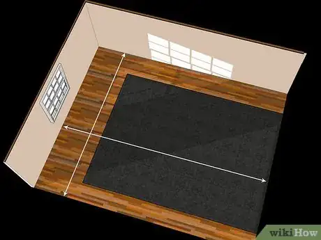
1Measure everything. If you want to plan your furniture arrangement and not need to constantly move heavy furniture until you find something you like, take measurements of everything first so that you can plan your space theoretically.
-
2Draw the room and pieces. You can draw the room onto graph paper based on the measurements you took (1' to every 3 squares, for example). Draw it with no furniture first. Then, draw your furniture on a separate piece of paper, to scale, and cut out the pieces. Now you can make practice arrangements, however you like.Advertisement
-
3Use room planning software. No longer is planning software limited to interior designers: there are lots of software options for planning out your room. From Chrome extensions like 5d, to games like The Sims (2 and 3 work great for this), there are tons of options to let you experiment with arrangements, color schemes, style, and sizing.
Setting Your Focal Point
-
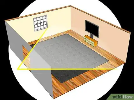
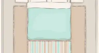
1Decide your focal point. The focal point of the room will depend on what room you're in. In a living room, it could be a picture window, fireplace or television. In a bedroom, it should be the bed. A dining room, the table. Figure out what the focal point of the room will be, since the majority of the furniture will be around it.
-
2Scale it properly. If you have the option to get an item of different sizes, get one that fits the space that it's in. For example, don't get a bed or dining table that is too big for the room. There should be a minimum of three feet around the large objects in a room, to make them usable.
-
3Move your focal point. Move your focal point, if you can, to the best spot in the room. This should be a place where, when you walk in to the room, you should have the focal point facing you and very prominent. Your eye should be drawn to the object.
-
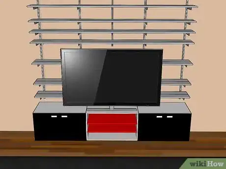
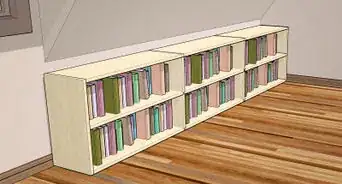
4Draw attention to the point. Draw further attention to the focal point later by placing accessories in this area. For a bedroom this will mean side tables with lamps or other items, while with a couch it will mean paintings or a mirror. A TV should generally be made more prominent with shelving or bookshelves, unless it is a part of a large entertainment center.
Positioning Seating
-
1Scale your seating. Once the focal point is arranged, you'll want to add some seating to the room (unless, perhaps, it is a bedroom). Make sure the seating you choose is the right size for the room. Leaving enough space, as with the focal point, to make it usable. For example, at least three feet should be available behind each dining chair. [1]
- Try to limit yourself to only one piece of oversized furniture in a single room. Too many and it will look crowded and cheap.
-
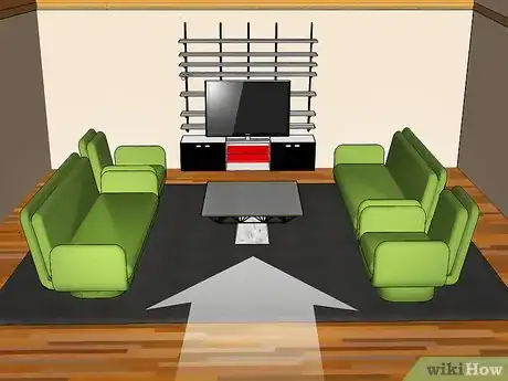
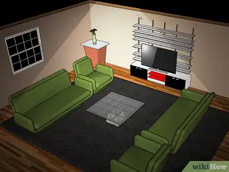
2Create an open arrangement. When you arrange the seating in the room, it should appear open and inviting when standing at the entrance to the room (or at least the main entrance). Avoid having chairs facing away from the door, for example.
-
3Use angles strategically. You can add drama to a room by placing furniture at an angle, but be careful. This takes up valuable space in a small room. Use furniture placed at angles only if your room is very large or you don't quite have enough furniture to fill the space.
-
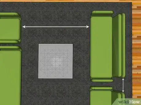
4Distance the furniture appropriately. When place seating in an area that will be used for conversation, such as living room furniture, you should be careful not to put the items too far apart or too close together. Roughly 6–8 feet (1.8–2.4 m) for seating pieces facing each other is a good rule of thumb.[2] Pieces places in an L shape should have 6"-1' between their corners.
Positioning Surfaces
-
1Create nearby surfaces. Especially in the living room (but also, to an extent, in the bedroom), you should have a surface within arms reach of every major seating spot. This is so that people have a place to set down drinks while talking. Try to leave these surfaces if you can. If they would be in the way most of the time, consider movable surfaces that can be dragged into position as necessary.
-
2Pay attention to levels. Surface levels should be appropriate to the area that they are in. Decorative tables at the edge of a room should be taller than tables next to a couch or chair. Keep items next to seating as level as possible with the arm of the seating object.
-
3Get the right size. Avoid overly large coffee tables or other tables. These can make it difficult to get around a room or get to seating (think of the poor guy taking the middle seat in an otherwise full couch!). Instead, make sure that there is roughly 1-2 of space between the edge of the table and the next piece of furniture.
-
4Consider your lighting. You likely will need to use some of the tables in a room as surfaces on which to place reading lights or lamps. Make sure that you place the table strategically so that all areas are lit and also so that outlets will be within reach for the lamps.
Creating Room for Movement
-
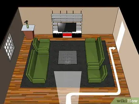
1Leave a pathway between entrances. If there is more than one entrance to a room, make sure that there is a clear and fairly straight path between them (it can "arc" around a seating area if necessary). This can also help divide a space and make sure each entrance has an open area facing it. [3]
-
2Avoid blockading paths. Think about how someone would need to move through a room. The consider where your furniture is. Is something going to get in the way? Make it difficult to get from one area to the next? Make sure these barriers are moved or at least broken up.
-
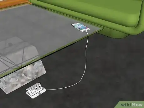
3Make sure all furniture and outlets are easily accessible. Not only do you want to be able to sit down on your couch easily, you also want to be able to reach things like outlets easily. Have at least one easily reachable with a nearby, low table. This will allow you a space to charge electronics, like phones and portable media devices.
-
4Separate spaces. You can also use furniture to break up large spaces, although this should be considered earlier on in the process. If you have a very large, open room, it will be better to use the furniture to break the space up into sections. For example, use the backs of couches in place of walls to create a living room and make the space on the other side the dining area.[4]
Placing Accessories
-
1Use paintings strategically. Paintings and other wall decorations placed high can make a space look bigger, while placing a painting above a couch and placing tables at either end will make that space look larger. Paintings can also help make a large wall look less blank.[5]
-
2Use mirrors strategically. Mirrors placed on a wall can make a small space look larger, by reflecting light and creating the appearance of more room in the room. You can effectively double the amount of space it looks like you have! But be careful...mirrors can easily make a room look cheap.[6]
-
3Size rugs carefully. Rugs should be sized so that they just fill the area they are placed in. Rugs which are too small or too large can make a room look just that: too small or too large.
-
4Use high curtains. High curtains will draw the eye up, creating the appearance of higher ceilings. It can also make a room look more proportional if your windows and ceilings are already high.
-
5Use size dependent items strategically. If you want to make a small room look larger, use furniture which is sized down and then avoid items which give it away, such as cups, bowls, or other standard size items. This is the dollhouse effect, where your room will have the appearance of being large and spacious but further away.
-
6Use symmetry. When placing accessories, or any furniture items, try to use symmetry. This is a quick cheat to making a furniture arrangement look better. Place a table on either side of a couch, a bookshelf on either side of a TV, a painting on either side of a table, etc.
Expert Q&A
Did you know you can get expert answers for this article?
Unlock expert answers by supporting wikiHow
-
QuestionHow do you arrange furniture in an awkward living room?
 Priscilla BettencourtPriscilla Bettencourt is an Home Stager, Interior Designer, and the Founder of Halcyon Home Staging + Design, a home staging business based in San Francisco, California. Halcyon specializes in expansive staging services geared to maximize a property's resale value and transform any home into an inviting environment for potential buyers. Halcyon has received the “Best of Houzz Service” Award in 2017, 2018, 2019, and 2020.
Home Stager & Interior Designer
-
QuestionHow can I separate rooms in an open floorspace?
 Priscilla BettencourtPriscilla Bettencourt is an Home Stager, Interior Designer, and the Founder of Halcyon Home Staging + Design, a home staging business based in San Francisco, California. Halcyon specializes in expansive staging services geared to maximize a property's resale value and transform any home into an inviting environment for potential buyers. Halcyon has received the “Best of Houzz Service” Award in 2017, 2018, 2019, and 2020.
Home Stager & Interior Designer
-
QuestionWhat happens if you have 2 focal points in a room? For example, I will put the window facing the lake as 12 and the fireplace at 9?
 Decor42Community AnswerYour focal point would be the first thing that you see upon entering the room, typically a fireplace or large window. The other would be addressed to complement your main focal point, the same as one would decorate a large wall to make a focal point and the adjoining walls would complement that wall.
Warnings
- Do not move furniture in a messy room!⧼thumbs_response⧽
- Be careful and do not move anything that is too heavy for you!⧼thumbs_response⧽
References
- ↑ http://www.hgtv.com/living-rooms/7-furniture-arrangement-tips/pictures/page-4.html
- ↑ http://www.bhg.com/decorating/lessons/basics/how-to-arrange-furniture/#page=6
- ↑ http://www.bhg.com/rooms/living-room/room-arranging/living-room-furniture-arrangement-ideas/
- ↑ Priscilla Bettencourt. Home Stager & Interior Designer. Expert Interview. 24 April 2020.
- ↑ Priscilla Bettencourt. Home Stager & Interior Designer. Expert Interview. 24 April 2020.
- ↑ Priscilla Bettencourt. Home Stager & Interior Designer. Expert Interview. 24 April 2020.
