3

I just watched the first episode of this anime and the plot seems pretty gripping but the art-style is what I found most interesting. It came out in 2013 so there weren't any technical limitations (at least that I'm aware of) but the animators decided to go with this style.

What is this style called? And does any one know why the designers used this as their style of choice?

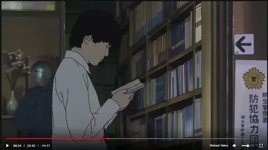
Scene 1 Scene 2

Callat
  • 3,024
  • 7
  • 30
  • 66
  • 1
    Eh, I'm not completely happy that this was closed as a duplicate. While the answer on the other question does mention that this art style is called rotoscoping, all it says beyond that is that it's "essentially drawing over live action sequences". There was a lot more about it that could have been said on an answer to this question IMO. (By the way, rotoscoping used to be common in Western animation: both the old Max Fleischer Superman cartoons and _Snow White_ used it. More recently, _A Scanner Darkly_ also used it.) – Torisuda Mar 18 '17 at 23:08
  • I had read once that they used this style to accentuate the weird/creepy vibes of the show (haven't seen it), but it could also have just been an experimental thing. There've been even weirder animation choices before (see *Gankutsuou: The Count of Monte Cristo*) – Mugtaba G May 27 '22 at 01:38

0 Answers0