2

This text from the Chobits title screen looks to me like a Japanese-English ambigram.

An ambigram is an art form that may be read as one or more words not only in its form as presented, but also from another viewpoint, direction, or orientation. The words readable in the other viewpoint, direction or orientation may be the same or different from the original words. [Source]

In Japanese, it's the title ちょびっツ, but if you look for an English word it looks very much like STUDY.
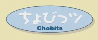
ちょびっツ Chobits

I'm wondering if there's any evidence that this is intentional. The font on the characters seems to make it more obvious, by making look more like an S, for example. Maybe this is subliminal messaging to encourage viewers to study more?

For those who don't see it:

  • looks pretty close to an S, but the one above looks especially like this one
  • looks like a small t if you remove the small loop
  • obviously looks like a U
  • looks like the D in this TRON-like font
  • looks like this y but a bit more curved and with a thicker "double strike"
anonime
  • 242
  • 2
  • 9
  • I don't know if it is intentional, but to me it does sort of look like STUDY. It's probably just our minds forcing patterns, though, like staring at clouds. – RichF Feb 21 '17 at 08:47
  • 1
    It looks a lot closer to the word *study* than some ambigrams look like their words. – anonime Feb 21 '17 at 14:26

2 Answers2

9

I'm going to say no, because:

  • It does not even remotely look like "STUDY" to me, and I can only barely see how you're coming up with that if I squint.
  • Some googling strongly suggests that nobody on the Japanese internet or the English internet besides you has ever made this observation.
  • While I do not know the exact font used here, it looks like a fairly orthodox "POP" font (or perhaps you'd call it a rounded/marumoji font), with little to suggest that it was specifically fiddled with to make it look like the word "STUDY".
senshin
  • 35,088
  • 25
  • 142
  • 247
  • Agreed. I don't see the resemblance at all (even trying to it does not look anything like "STUDY" to me) and I can read Japanese. I'd think if they were going to do this deliberately, it would be done in a way that would be recognizable to an audience who can read Japanese (and probably not English very well), since that was their target audience. – Logan M Feb 21 '17 at 07:56
  • 2
    That word also has no particular resonance to the story, so there's no reason to do it (I also can't see the slightest resemblance though. I think the OP is [seeing faces in rocks](http://www.thisiscolossal.com/2016/11/the-japanese-museum-of-rocks-that-look-like-faces/).) – Torisuda Feb 22 '17 at 01:49
  • Maybe you can't see the resemblance because you're not used to looking at different English fonts. The 'び' looks just like a 'U', 'っ' looks like a 'D' without the back (this already eliminates every other letter as a possibility, and uniquely looks like a D), 'ツ' looks like a 'y'... – anonime Feb 22 '17 at 14:33
  • [This TRON font](http://i37.photobucket.com/albums/e83/scarletguard/Fonts/TronLegacyCreditFontExample2.jpg), for example, has a D that looks like tsu. – anonime Feb 22 '17 at 15:02
  • @Torisuda [How about this one?](https://upload.wikimedia.org/wikipedia/commons/f/f3/Dean_Franklin_-_06.04.03_Mount_Rushmore_Monument_(by-sa)-3_new.jpg) – anonime Feb 23 '17 at 01:19
0

Chobits is a mix of the words "a little" (chobito) and "bits" (bitsu). I am fairly certain the relevance to English ends there.

Kiflaam
  • 1
  • 1