1

The opening sequence of the first season of anime series Ushio to Tora contains a series of images which might be distorted calligraphy, sort of like what Picasso might have done. There are a set of 6 varied-color frames, a short vertically scrolling sequence, and finally the title, which is clearly calligraphic and much less distorted. After that, the credits actually begin, now in a normal Japanese font. Here some are:

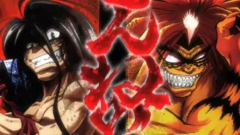
First:
possible calligraphy 1, red

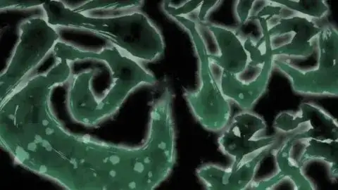
Second:
possible calligraphy 2, green

Seventh:
possible calligraphy 7, vertical scroll red

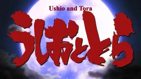
Title:
calligraphic title plate

You can see them all beginning at time mark 4:30 of episode 1. The Seventh one is partial, a single shot from a short, vertical scrolling sequence.

I don't know if these are distorted calligraphy or not. But going backwards beginning at the Title plate, there certainly appears to be a commonality of design. If they are calligraphic, are they legible? If so I imagine they would be concepts such as courage, fate, etc.

If they are not calligraphic, what are they? Do they symbolize something I should recognize?
senshin
  • 35,088
  • 25
  • 142
  • 247
RichF
  • 3,134
  • 3
  • 20
  • 42

1 Answers1

2

I guess you could describe this as calligraphic. I don't know enough to say whether this is what a calligrapher would consider genuine art vs. just being writing with bold and swishy brush strokes.

This writing doesn't "symbolize" anything, though - it's just the lyrics of the first verse of the OP theme as they're being sung.

  1. 混ぜんな mazen na
  2. 危険な kiken-na
  3. やつらが会いすりゃ yatsura-ga ai-surya
  4. 土壇場 dotanba
  5. 土壇場 dotanba
  6. じゃないか janai ka
  7. 混ぜるな危険のねんごろ mazeru na kiken-no nengoro (written bottom-to-top)

I don't want to venture a translation here, but see e.g. Lyrical Nonsense for one candidate translation.

senshin
  • 35,088
  • 25
  • 142
  • 247
  • Thanks! I was not even sure if it was writing. It was so blobby my mind was trying to identify shapes, like one does with clouds. In *First* I thought I might have identified two elements. The 2nd character from upper left kind of looks like a kid falling backwards, holding a purse with outstretched arms. Then the 2nd character diagonally away from lower right reminded me of a cartoon hedgehog. So if I could "see" those things, I was wondering what else I might be missing. At the same time I suspected it was writing, though. – RichF Jan 12 '17 at 13:10