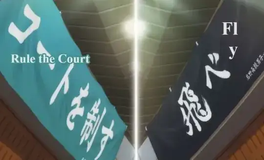
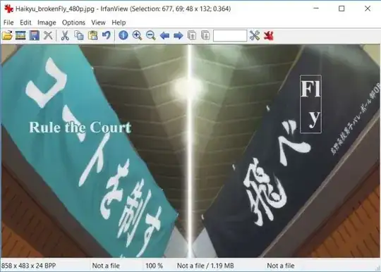
The picture below is a partial screen cap from time mark 1:44 of episode 24 of Haikyu!!, 2nd Season.
 My main question involves Karasuno's team banner, with the calligraphy for Fly. Several times this season the banner's translation is shown with the word "Fly" broken into two lines. In each episode, there was obviously room for the "y" to appear on the same line with the rest of the word.
- Was splitting it a pure mistake, possibly caused by some production issue? I can imagine that maybe the translator was rushed and confused, or perhaps somehow could not tell that the entire word "Fly" would have fit on a single line.
- Was the split done out of habit? I've seen that Japanese is sometimes written horizontally and sometimes vertically. Perhaps the translator just did not realize how odd it would look in English to see a 3-character word split.
- Was the split a pure artistic choice? It seems unlikely, but maybe there is some concept within the Japanese calligraphy that could be expressed in English by splitting the word "Fly". I can sort of get it -- Fly, by its very nature, is a vertical concept.
Since the same frame contained Aoba Johsai's banner, I might as well ask the opposite question concerning it. Why did the translators not split the word "Court" from the rest of the slogan so that it would appear below "Rule the"? This would allow the translation to not overflow the banner, as well as avoid a partial overwrite of a second calligraphic character.
The cinematography of the banners here is interesting. They are intentionally juxtaposed thematically, not as they actually were placed in the stadium. Perhaps the key is not in the individual slogans, but in the viewing them as a set.
