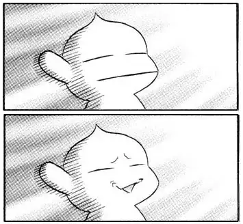
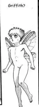
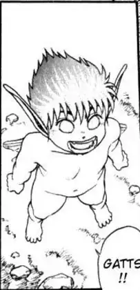
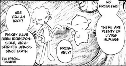
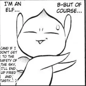
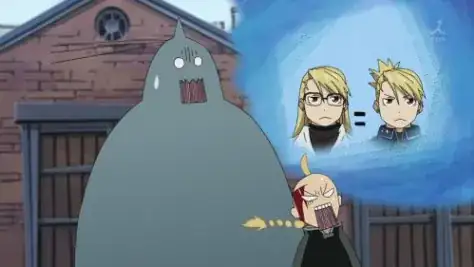
This is for comic relief purposes only. The technique is known as Deanimation/Cut-Out. Check more details below.
http://www.japanpowered.com/anime-articles/anime-facial-expressions
Here read the part about Deanimation cut out. Another one of the Top Manga (and Anime) which uses this is Full Metal Alchemist. The purpose is the same for i.e. Comic relief especially with the Elric Brothers.

Saying this is neglecting detail is kinda offensive to me cause the attention to details, the beautiful and horrifying art work is one of the main reasons many people still read Berserk even though it is a disappointment that the progress has been so slow.
Also google "Puck's Funny Expressions". I know it can be jarring but lots of people (me included) find the little humour in the dark and gruesome world refreshing.
