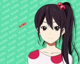
Kaname Madoka from Puella Magi Madoka Magica and Nakano Azusa from K-On! have a broken line for mouths.


Why do characters in some art styles have a broken line for mouths? The lines are broken unless it defines lips but I don't know otherwise.
Kaname Madoka from Puella Magi Madoka Magica and Nakano Azusa from K-On! have a broken line for mouths.


Why do characters in some art styles have a broken line for mouths? The lines are broken unless it defines lips but I don't know otherwise.
I think the explanation given in moegamisama's answer is a step in the right direction; however, an argument purely from high-level principles about moe/cuteness lacks sufficient explanatory power to explain why this particular style ("broken line" mouths) is often seen. I think a more mechanistic explanation for why mouths are drawn this way is also necessary.
Taking for granted that the minimization of some facial features (a small nose, compensated by large eyes, say) is a common feature in "moe" character design today, and observing that the mouth is an oft-minimized feature, the mechanistic explanation, then, is as follows.
Take a close look at the way Madoka's mouth is drawn in the picture you posted. You will notice that the thickness of the line that represents her mouth is not constant. Rather, it is thickest near the edges and becomes thinner as we approach the center of her face. The line "breaking" at the center of her face strikes me as an artistic convenience: rather than drawing a super-thin line there, the artist simply omits the line altogether, and the viewer's mind merely fills it in (this is the so-called "principle of closure" of gestalt psychology). You see the same thing (albeit less delicately) in the picture of Azusa.
In short, this choice is likely because it makes the character look "cute."
However, why exactly does this make the character look cuter? To understand, we'll have to take a look at the aesthetic theory behind moé.
Some central components of cuteness are, according to Sianne Ngai (professor of English at Stanford who has done a lot of research into aesthetic categories) "smallness...incompleteness...and vulnerability." Ngai cites Hello Kitty as an example of this, noting that Hello Kitty's complete lack of a mouth creates a kind of "power differential" which is appealing to consumers.
Source (Note: you can't read the full text here without paying for it).
These qualities are similarly expressed by an incomplete mouth. This, in addition with very soft lines and colors (compare these character designs to anime like JoJo's Bizarre Adventure) creates a childish and defenseless aesthetic.
This aesthetic can be used for a number of purposes. For instance, the characters in Madoka Magica (noted in the question) were likely designed to emphasize innocence and powerlessness in order to create contrast with the dark atmosphere of the series as a whole and evoke pity or sadness from the viewer.
In reply to Aki Tanaka's comment, it doesn't look better, but it looks cuter. Also, the big eyes make it look cute because of all the highlights in the eyes.
Death Note style works for the anime because of the genre and theme of the show. It is a dark and gritty show. You don't want see happy anime girls killing a bunch of people with a notebook.
It also helps the animation. If the animator is drawing the face of Light Yagami from Death Note or Jotaro Kujo from JoJo's Bizarre Adventure, then it would take longer frame by frame. However, if the animator is drawing the face of Maka from Soul Eater, it would not take that long.
I think the mouths are like for the same reason to draw it faster. The references probably from young girls because their lips are not that big.
Ends of the mouth create a cavity in real life, often causing the said part to be more shadowy, while shut lips create a more even surface, resulting in even light distribution. You can even observe this in realistic drawings.
Now translate this into lineart, and you get emphasized ends and leaving the middle empty strengthens this as the brain completes it anyway. It looks pretty attractive too, IMO.